
The State of JS 2019 survey left many in awe of the beautifully rendered line graph created by Amelia Wattenberger. So we’ve brought her on JS Party to discuss how she built it!
We’ll chat about all things D3, a JavaScript library for creating data visualizations, and even learn a bit about the CSS cascade.
Featuring
Sponsors
Rollbar – We move fast and fix things because of Rollbar. Resolve errors in minutes. Deploy with confidence. Learn more at rollbar.com/changelog.
DigitalOcean – DigitalOcean’s developer cloud makes it simple to launch in the cloud and scale up as you grow. They have an intuitive control panel, predictable pricing, team accounts, worldwide availability with a 99.99% uptime SLA, and 24/7/365 world-class support to back that up. Get your $100 credit at do.co/changelog.
Algolia – Our search partner. Algolia’s full suite search APIs enable teams to develop unique search and discovery experiences across all platforms and devices. We’re using Algolia to power our site search here at Changelog.com. Get started for free and learn more at algolia.com.
Notes & Links
Transcript
Play the audio to listen along while you enjoy the transcript. 🎧
Welcome to JS Party! I’m Emma Bostian, and I’m really excited because we have a really fantastic guest on today, that I’m really excited to talk to… And I don’t know how many times I can say the word “excited” in this introduction. Before I introduce her, I just want to give a shout-out to Jerod, who is also on the line… And we are thrilled to be interviewing Amelia Wattenberger… Watt-watt – can you please say this out loud? I had this in my head, I was like “I’m gonna nail it”, and then I did not nail it.
[laughs] Amelia Wattenberger. You were close.
There you go.
I’m overthinking it, I’m overthinking it…
Yeah… [laughter]
Well, welcome [unintelligible 00:01:47.08] first of all, that you’re here today. Amelia built the amazing overview chart for the State of JS Survey, and was recommended by one of the creators of the State of JS Survey, Sacha Greif.
Yeah, shout-out to Sacha. Thanks for suggesting this guest.
Yeah, absolutely! And shout-out to them for having a really cool website, because it is one of the coolest websites I’ve come across. And those charts - I’m thrilled to be learning about D3 today. Would you like to introduce yourself a little bit, Amelia, and tell us who you are, what you like to do, and all that fun stuff?
Yeah, sure. I’m Amelia, and I am primarily a front-end web developer, but I focus on – I also do design, like UI and UX design, and I focus on data visualization… So I like working on things like designing data viz, parsing data, visualizing data in the browser, which has all sorts of implications. I currently work as a front-end web developer at a small startup who works with publisher analytics.
That’s super-cool. Did you have any kind of background in research, or in data anything before you jumped into playing around with data visualization?
Yeah, so in college I thought I wanted to be a prison psychologist…
Hm.
Whoa…
I was planning on going to grad school, and I actually worked in a research lab in Texas right after I graduated… And I studied neuroscience and psychology, and then after hanging out with grad students for maybe a few months, I decided that I did not want to go to grad school… [laughs] So I think I just redid my personal site as many times as possible until I got a developer job.
Wow, that’s super-cool.
How many times is those many times?
Probably once every other week… [laughter]
I wish I had that though, because I need to create one in general… Like, I would rather be building too many than none, which is currently the state of my portfolio… So I’m curious what drew you into D3. First of all, can you tell us what D3 is?
[03:58] Yeah, so D3 stands for Data-Driven Documents, and it’s a JavaScript that is from the jQuery era; I think it’s maybe ten years old at this point, so it’s been around for a really long time. I see JavaScript libraries that help with data visualization on kind of a spectrum, where at one end you have D3, where it’s more low-level, and on the other end you have charting libraries that kind of do all the work for you. I think Recharts is one, React Charts… There’s a lot of those.
But then on the left side of the spectrum, really D3 is the lowest level that you could get, where it has a lot of utility functions that help with transforming data into visual dimensions, like turning – let’s say you’re visualizing temperature, so a lower temperature will be on the left side of the chart, and a higher temperature will be on the right side of the chart… So how do we go from temperature to pixels to the right? D3 really helps with those really low-level “I’m gonna make the whole chart myself, but I could use a little bit of help… But I’m not gonna rely on a charting library to do it all for me.” So it’s harder to learn, but it’s way more powerful once you get the hang of it.
Yeah, I would say - as somebody who’s known about D3, and I think I’ve used it before, long enough ago… Like you said, it’s been around forever; I think 2011 in the chat room is what they’re saying, so the jQuery era for sure…
Yeah…
It’s been around so long that I think I’ve used it and since forgotten even how to use it… But it has this reputation of being hard, and I’m just curious why you think that is. Maybe it’s just because it is hard to use, maybe it’s because of the low-levelness, or it’s powerful… Sometimes power tools have sharp edges… What do you think is hard about it, and was it hard for you to pick up on it?
Yeah, for sure. So I went through a very typical route for learning D3, where I think most people who use it are primarily developers, and at work they have to make some kind of dashboard page, or they have to make a chart… And then if you google “JavaScript chart”, you’re probably gonna come across D3 pretty quickly… And this might have been seven years ago - so seven years ago when you googled “D3 chart” or “D3 line graph”, you’d come across tons of examples of D3 code online that go through, start to finish, “This is all the code involved in making a line chart.” So I did what pretty much everyone does, which is you copy that code, you put it in your application, and then you change the numbers until things work… [laughs]
Yes…
Because it’s not one line of code; it’s not a ton of code, but it’s not this one function that draws a line chart. So over the next five years I had to make more and more charts… And you slowly get to know the library, but it can be really frustrating if you’ve copied and pasted the code. You kind of understand most of it, but not all of it, and then your chart looks kind of weird in a certain browser or with certain data, and then you’re like “Oh, okay, let’s change this one thing”, and then it gets really hard to maintain, and really confusing, and no one really understands your chart code.
So because D3 had such a good ecosystem of people posting their code online, it was kind of a double-edged sword where – I think that saying works… Where it’s both a good thing where people can learn it really easily, but they don’t get a proper introduction, and it’s almost too easy to get to that code… And there weren’t really good, comprehensive docs for understanding what each line does.
I think that’s part of why people have such a hard time learning D3 - they jump into the deep end, because it’s so easy to get there, and then you kind of have to swim upstream to figure out what everything does. It’s both hard and easy at the same time.
[08:05] That’s interesting.
And the other reason I think it’s so hard is the whole reason I think data visualization is so hard - because it’s where a bunch of different fields meet. You have to learn visual perception, you have to learn user experience design, how are users viewing charts, what could be confusing about a chart, and you have to learn data analysis, statistics… There’s a whole set of things that you have to learn in addition to D3. So I think because a lot of developers are like “I’m gonna make a chart. I’m gonna use D3…” There’s just a lot to learn to do with making a chart in the first place.
I’m curious about the accessibility of D3, because accessibility is really hard for charts. I’m pretty sure, if I’m not mistaken, certain charts you can have read out by a screen reader, and tangible pieces of data, like bar charts and maybe like pie charts for example, but things like line charts - those can’t necessarily be read by a screen reader, and typically I think they have to be exported to a .csv file, if I’m not mistaken… How is the accessibility of D3?
Totally, that’s a great question. The way D3 works is it has a lot of different modules, and some of those modules – it’s kind of like the jQuery parts; they’ll help you draw to the DOM, and those modules, you could either draw with SVG or Canvas. Most people use SVG. If you draw a Canvas chart, you’re pretty much out of luck. You can just put text underneath it… But if you draw a chart with SVG, there’s actually ways - and it’s also really hard to find any resources on this, but if we’re talking about screen readers, then you can tab through it in the same way that you could tab through, say, a list.
I’ve seen examples where you can tab into a chart and it’ll say “Chart width - 10 data points.” And then you can either skip that if you don’t want anything to do with it, or you can tab into it and go through each data point… And there’s ways to put – with SVG there’s a title element and a description element; I think those are the two. There’s actually a few others, but you could tell the screen reader what to read out for every single data point. So with a line chart, you could say “If you’re tabbed into this data point, say ‘data point 1 out of 10. Temperature is 70 degrees, and the day is June 1st”, and then the person could tab through each one of those. But that’s something that’s very rarely done, and it’s even more rarely done well. And you also lose a lot – like, the whole reason you visualize data is because we wanna interact with it in a visual way, and it’s hard to translate that to an auditory experience.
For sure. So when we talk about D3’s low-levelness, or the layer of abstraction, what we’re talking about is the way you interface with that is at a more granular/lower level than you would another charting library… So if you’ve used a high-level charting library, you may say “library.linechart” and you’ll pass it a series of data, right? And you’re basically done at that point. “Here’s my array of data”, or maybe it’s more complicated than that, but “Here’s a list of things. Go ahead and chart that. I can configure you to change your colors, and whatnot.”
Yeah. Which is so nice when it works.
Yeah, which is so nice when it works. But with D3 you’re actually working at a lower layer, where maybe that library is actually telling D3 what to do underneath the covers, but you’re drawing polygons, you’re drawing lines. You’re actually programmatically or imperatively telling it what to do at maybe the drawing layer, if you think of it that way. So that’s powerful, but difficult to pick up. Charting libraries at higher levels are easier to pick up, but less powerful… How do you help folks make the decision of like “Where do I fit in? Do I go for D3 and just dive in, and I can be a craftsperson, and just get underneath there? Or am I happy with a higher-level thing?”
[12:15] Do you have to make those decisions on a regular basis? I mean, you’ve learned D3 very well, so you’ve grabbed the power tool, but what about somebody new? How can you help them make that decision?
Yeah, yeah… And one fun fact is that most, if not all JavaScript charting libraries are probably using D3 under the hood.
Yeah.
That’s so hard… There are no absolutes…
Sure.
…but if you don’t have a lot of time and you just wanna make a chart, and you wanna move on with your life, then don’t reach for D3; it’s not worth your time. There’s tons of libraries that will do everything for you… So just look for certain chart libraries and grab one of those, go through their docs, see their examples; there’s probably one that fits what you need.
But also if you need a custom chart type, you’re not gonna find a chart library that lets you do pretty much whatever you want… So in that case, you’ll probably wanna learn D3. So if you have a lot of time, if you’re interested in learning it, if you’re working on a dashboard or something where performance is really important and there are gonna be a lot of visualization components of it, then I think it’s definitely worth learning D3.
Also, when I say “learn D3”, I don’t see it as this huge, overwhelming process. It’s totally modularized, so there’s maybe 40 different modules that go into the D3 library. They’re all in the D3 GitHub, so I think if you go to github.com/d3 you can see all of the different modules. They’re separated into – there’s a color module, there’s a hierarchical data module, there’s an array module that has methods for manipulating data in arrays… So you can really learn it module by module. I think the harder part to learn is like “What are the steps that go into creating a chart? How do I update that chart, and how do I make a good chart?” I think those are probably the harder things to learn, and then you could dive into the D3 library to figure out what modules you need for each part. That’s my train of thought. [laughter]
I’m curious, when we talk about data visualization, what are the different types of – I see the overview chart you did for the State of JS Survey was obviously a really complex line chart, but what other type of data viz are there, and how do you know which one to pick?
So chart types?
Yeah, so like what kinds of things can D3 do? You have the line chart, and I assume it can do bar charts… What other kinds of things can it do? If I have a data set, how do I know I should choose a line chart over a bar chart, for example?
Right, that’s a good question. Talking about the different modules, there are some modules that will just spit out – you have to do a little bit of stuff first, but they’ll spit out a circle packing diagram, or a tree map… A tree map is like when – I think the old Windows used to have these partition sizes for your different Windows partitions, or just partitions… That’s kind of what a tree map is.
For a few of the more common complicated graphs they’ll have just a method that you say “Hey, draw this chart for me”, and it’ll get you pretty much there. The way I usually use D3 is I will only use the utility functions, like “Turn these temperature numbers into pixel numbers” or “Turn this set of numbers into colors”, and then because I’m usually working in some kind of JavaScript framework like React, I’ll just create those SVG elements using, say, the React render( ) function, and use D3 for like “Help me transform this data into physical attributes.”
[16:06] So it both will help you draw a ton of different complex charts, in which case there are tons, and there’s also D3-libraries that are just – people created them who don’t have any affiliation with D3. But you can make pretty much any chart type that you want, but you’re not gonna get that easy function that’s like “Draw me a tree map.” [laughs]
“Draw me a tree map…”
Yeah, so you mentioned you use D3 with React… Does it integrate really nicely with other JavaScript frameworks and libraries? Or is it specific to a few?
D3 and React is like my favorite workflow for personal projects. If I wanna visualize some data, I’ll just work through it and I’ll create a React component, and work through it that way.
They work really well together as long as you don’t use the D3 functions that will manipulate the DOM. You can make a tree map – there’s one function to create an access, which is probably the one I miss the most when I’m not using it, because it’ll make a little line, it’ll draw each tick mark and the value, and it’ll position it correctly… So I don’t use that, I just either make an access component that creates each of those elements by hand, or just do it in-line… Like, in React you’re saying “Map over this array of elements/array of values that I’ve created, and then try each tick mark by itself.”
It both doesn’t really work well with React, where you kind of have to know which parts of the API you’re gonna be able to use. There are ways of using those functions within a React component, but it makes me a little bit uncomfortable, it gives me the hibbie jibbies to have D3 manipulate the stuff that React is rendering out… Because it seems a little bit hacky. [unintelligible 00:18:08.29] the virtual DOM, and it has all these performance benefits when it knows what the elements are… And it kind of creeps me out to change that with D3 or anything else… Because React doesn’t know about it. But you can. [laughs]
I actually played around with Svelte recently, and it’s really nice. It’s actually a really similar workflow using Svelte and D3 as using React and D3… But one big issue with visualizing data with React is animations are not easy with React, and especially enter and exit animations and transitions. Svelte has some custom – they have some built-in, and it just makes that part a lot easier. So that was really nice…
Yeah, I just found out about react-spring. It’s kind of my thing I’ve been working with this year. It’s a physics-based animation library and it makes transitioning so much easier, so I’d recommend that if you are having trouble doing those complex animations.
I have one more question before we take a break here… What are the alternatives to D3? Have you tried them, and why is D3 so powerful?
I don’t know if there are any alternatives to D3, just because 1) it’s been around for so long, and it does what it needs to do really well… So I guess no one’s struggled enough with a specific problem that they were like “Screw it, I’m gonna make my own library.” So as far as the low-level utility functions go, I think D3 is the main one, if not the only one.
Then there’s also, further along on the spectrum, the charting libraries, where you don’t really need to learn D3… Until you do.
Alright, so we are back… We’ve learned a lot about the foundations of D3, and now I wanna dive a little bit more into some of the cool projects that you’ve built, Amelia… Because for those of you listening who haven’t check out her portfolio, it is a must do. I’m gonna link a couple of things down in the show notes, and I wanna talk a little bit more about some of these… But you have the coolest article I’ve ever seen on the CSS Cascade, which is how styles are applied to different HTML elements. So it’s kind of about specificity and how styles are applied… How the heck did you build something so complex? How did you even come up with this idea in your mind, the design for it, and then how did you execute it? How long did this take? It would have taken me 12 years to build this.
[laughs] The motivation for that post is largely that this is something that I get confused in my head all the time… So if anyone has felt like they’re fighting with CSS, like “I have a class and I want this text to be blue, but there’s apparently some other class somewhere in this massive application that makes the text red”, and then you just put the element type in front of the class, you do div.class in the CSS and then you’re like “Okay, I win this time”, and then you go back and ten weeks later you’re fighting with ex-you, or the old you…
Current you is always the most important, so you’re just bang important yourself, you know…
Yeah, yeah… And you know you’ve done something wrong, so you feel bad about it, but you do it anyway…
Right, you did it anyway, because you’re trying to get this thing to stinkin’ work…
[laughs] Yeah… That is me sometimes, and so I was like “I’m gonna learn this thing for real, I’m gonna figure out why certain selectors win over other ones.” Because I think most people who have been doing web development for a while have some idea, but it had never been formalized for me.
So I dug into this spec, which is actually pretty readable for the CSS Cascade, for the most part… And then I was trying to figure out “Okay, how can we visualize this? It’s called a Cascade, so let’s do a waterfall, of course… That’ll be easy, won’t it?”
Well, let’s just stop and let me describe this page for those who are driving in their car and they can’t look at it. First of all, view it on desktop, because on mobile you’ll totally miss it. I was gonna ask, “How do you handle mobile?”, and I moved my screen over and it’s like “Well, I punted. That’s fair.”
So along the left-hand side of this web page, which is in the show notes, you will see an actual animated waterfall, that I assume was drawn and somehow created… And it’s the navigation for the web page; so it starts with importance, and then it kind of goes over [unintelligible 00:23:37.26] works its way down. So Amelia has actually visualized the cascade with an animated waterfall. Very cool. So that’s what we’re talking about… Continue.
Thank you. I should open it up for myself, to remind myself… [laughs]
If I made this, I would just have it as my desktop wallpaper, and I’d just stare at it every day, like “Yeah, I made that…” [laughter]
[24:01] So the hardest part for this was just going from spec to figuring out what the different tiers are. What way can we visualize this that will kind of make it stick with you? So I fudged it a little bit; this isn’t exactly what the spec says… The first tier… Basically, the way the cascade works is the higher up something is in the cascade - you have a certain selector, and a selector that is higher up in the cascade will win over a selector that’s lower in the cascade.
The way I broke it down - it has four tiers. The first tier is called “Importance.” I didn’t know what else to call it… And basically, the way the spec is written is – these steps are kind of meshed together. Transition and active transition will win over anything else… And then below transition is anything you put “important” on, and then there’s active animations, and then underneath that all normal styles.
So this spec is a little bit weird, where the next tier that I have is called the Origin. Was it a style on your website, was it a style that a user has on their own browser, or is it a style specified for the browser itself? We all know that - or maybe we don’t - buttons look different in Chrome than they do in Firefox, and that’s due to the default styles that browsers have… So those button styles will never override the user styles, unless they have “important”, which I don’t know if there are any “important” browser styles; I doubt it, but I would love to know if there were, because then it would basically be browsers saying “I want this style, and you can’t do anything about it.”
[laughs]
It should be interesting.
Yeah. We need to do a whole episode on CSS specificity, because it’s so fun! People don’t understand that there are mathematical equations behind these – not equations; I mean, they’re not calculus, it’s simple addition… But people don’t understand that different selectors, the way that you select these elements from the DOM actually assigns a point value to them… And this can be quite confusing.
Yeah.
One thing that Amelia did that’s really cool here is she’ll put two rules next to each other, and then you have to guess which rule would actually win… And then “Show me the answer.” Amelia, you may not know this, but Emma just created a JS Jeopardy episode last episode, in which she had crazy questions, and stuff… I see a mash-up coming, like “CSS Selector Jeopardy”, where you basically give two rules…
That’d be great…
Can you imagine us all being like “Okay, [unintelligible 00:26:38.26]” It might be tough.
[laughs] Yeah, imagine everyone listening would tune out… No one wants to listen to that.
I think everybody playing would also tune out.
But I’m curious, how did you make these – basically, on this article there are two different code snippets, and you select one or the other as your choice, and then if you’re right or if you’re wrong, it reveals the answer with a definition or an explanation… But how did you build this interactive code snippet?
Yeah, so this is all built in React, and I’m the worst about linking things, but the code is actually all on GitHub, if anyone’s curious and wants to check it out. They’re basically – each quiz is like a custom component (I forget what I called it; maybe “quiz”) and it uses a React hook that stores the answer. So if you click the left one or the right one, question A or B, it will store that in the state, and then once that piece of state has a value, then it’ll show the answer and tell you if you’re right or wrong.
The elements on the page are just two divs using Flexbox, with code snippets in them, and another div underneath with the answer.
[27:54] That’s so cool. This article was great… Not just because I love specificity and I think it’s great and everyone should fully understand it, but because I just think it’s the most beautifully chaotic website I’ve ever seen… And I don’t mean that in a bad way. There’s just so much hidden meaning… I’m gonna be honest right now - I saw that it was a waterfall, and it didn’t fully hit me until we were talking about the cascading waterfall… And I was like “I get it!”
“I get it! I see what you did there…”
[laughs] Well, I was just gonna say, I’m always looking for ways to use the web, or the way we can use browsers to our advantage. I feel like we had newspapers, and then we made the web for documents, and then we were like “Alright, we’re gonna put these newspapers on the website, and it’s gonna be great, and… That’s it. We’re good. This is peak web.” But browsers are so capable…
Yeah.
The things that they can do these days are amazing. There’s all these three.js, WebGL examples in the browser, that I remember blowing my mind 5-10 years ago…
You’re right.
…so every time I explain something on my blog, I like to think through “What are ways that this might more closely match a reader’s mental model?” or ways that it might stick with them better, and what new tech is there, what can we use/abuse? I’m sure this site won’t age well and will be a huge pain in the butt to maintain, but it’s fun right now… [laughs] Future me will hate it, but I don’t know… I like using things like scroll events; like if you’re a certain amount down the page, then do something in like a static side panel…
Another one of these posts has a long code example. It’s actually about doing interactions with D3. So it has that one code example on the right, and as you scroll, it updates the code with the updated code… Because it can be really hard when you’re reading a blog post to have these separated code snippets of like “Here’s your code. Okay, here’s another snippet of code” where some things are overlapping, but you don’t really know where in your previous code example that new code would fit in… So I just like trying to take advantage of the technology that we have, and trying to think through like “Oh hey, if we do this, would this make it easier to learn?”
Yeah, I think that’s really great. So you’ve got a lot of blog articles, but you’ve also got a really long blog article, also known as a book…
[laughter] A really long blog… A book-length blog, called a book.
Yeah…! [laughs] So Amelia has published a book called Fullstack D3 and Data Visualization, which is going to be linked in the show notes… And I would love to talk about the fact that you wrote a book because I think that is pretty freakin’ cool. Can you tell us how this process of writing this book was? Did you ever have impostor syndrome writing this? Because writing a book is terrifying, and I can only imagine where the technology is convoluted or difficult to learn, that this was probably one of the hardest things you’ve ever done…
Yeah. I mean, I still do have impostor syndrome, I just try to ignore it as much as possible. The book was really hard, related to what I was saying before, because I’m used to working on the web, where you can have links, and you say “Oh, here’s a list”, and I can refer to things on it, and everything’s interconnected… And then writing the book was like – it needs to have a linear flow, and that was probably the hardest part.
And as far as writing a book in general, I could never write a non-tech book. The reason that I could write this book at all was that – basically, the process was I wrote a code snippet, or I outlined the whole book, and then for each chapter the first step was “What code should we build that would help teach this concept?”
[32:09] And then I just – you know, I’m a developer, I’m very used to this… I wrote the code first. And then I kind of took notes on “Okay, what did I do first? What did I do second? What are the concepts that we need to learn for this?”
Then for writing the chapter, it was really just like documenting “What did we do? What are resources that can help someone understand these concepts? What are the different concepts?” Without starting by doing the code, I could never have written a book.
You almost reverse-engineered your process by looking at your end product. You wrote the code, and then you were like “Okay, how do I reverse out what I just did in order to write that down?” That’s pretty cool.
Yeah, exactly. Yeah.
What does Fullstack mean with D3? Because to me, Fullstack means front-end and back-end…
[laughs] I know…
D3 is an animation – it’s not animation; you know what I mean, it’s a visualization library…
Yeah, so Fullstack - the company is called Fullstack, and they have a series of books. A Fullstack Node is coming out, they have Fullstack React, Fullstack Vue, and I think…
Gotcha. So this wasn’t your title.
Yeah, so I think it comes from like – for example, the Fullstack React book is like “We’ll take you through the entire ecosystem. We’ll teach you what testing libraries make sense”, that kind of thing. They actually recently rebranded to Newline… So I don’t know what that means for book titles.
Are you going to rename your book?
[laughs] I don’t think so, but that’s a good question… It’s just part of a series, I guess.
Gotcha.
That’s awesome. So I’m just curious, how long did it take you to write this book?
I started last December. Not December 2019, but December 2018… So over the New Year’s I started, and then we finished I think April. So it was pretty fast, but it was also pretty intense. I was writing ten hours a week, or something like that… Because I still had my full-time job, so in the evening I’d write a little bit; I’d have Saturday, I’d go to a coffee shop and write a little bit… So I guess it seems short, but it also felt long.
Well, the million-dollar question is “Was it worth it?” Now you’re looking back at it… Would you do it again, or are you like “Yeah, I’d never do that again”?
Oh, totally. I would never write that book again… [laughter]
Isn’t there gonna be a sequel?
Oh God, no… I don’t know if I could do that. I would definitely write a tech book again… It was definitely worth it, if only for the reason that over my career as working as a developer on dashboards, this really gave me a chance to take a step back and think through “What have I learned? What are these different concepts?” and kind of formalize them, make sure what I have in my head matches what the actual code is. I learned a lot writing the book, which is really valuable to me… Because I’m sure there were tons of things that I never would have done a proper deep dive on, if not for “This needs to be right, because I’m telling it to other people.”
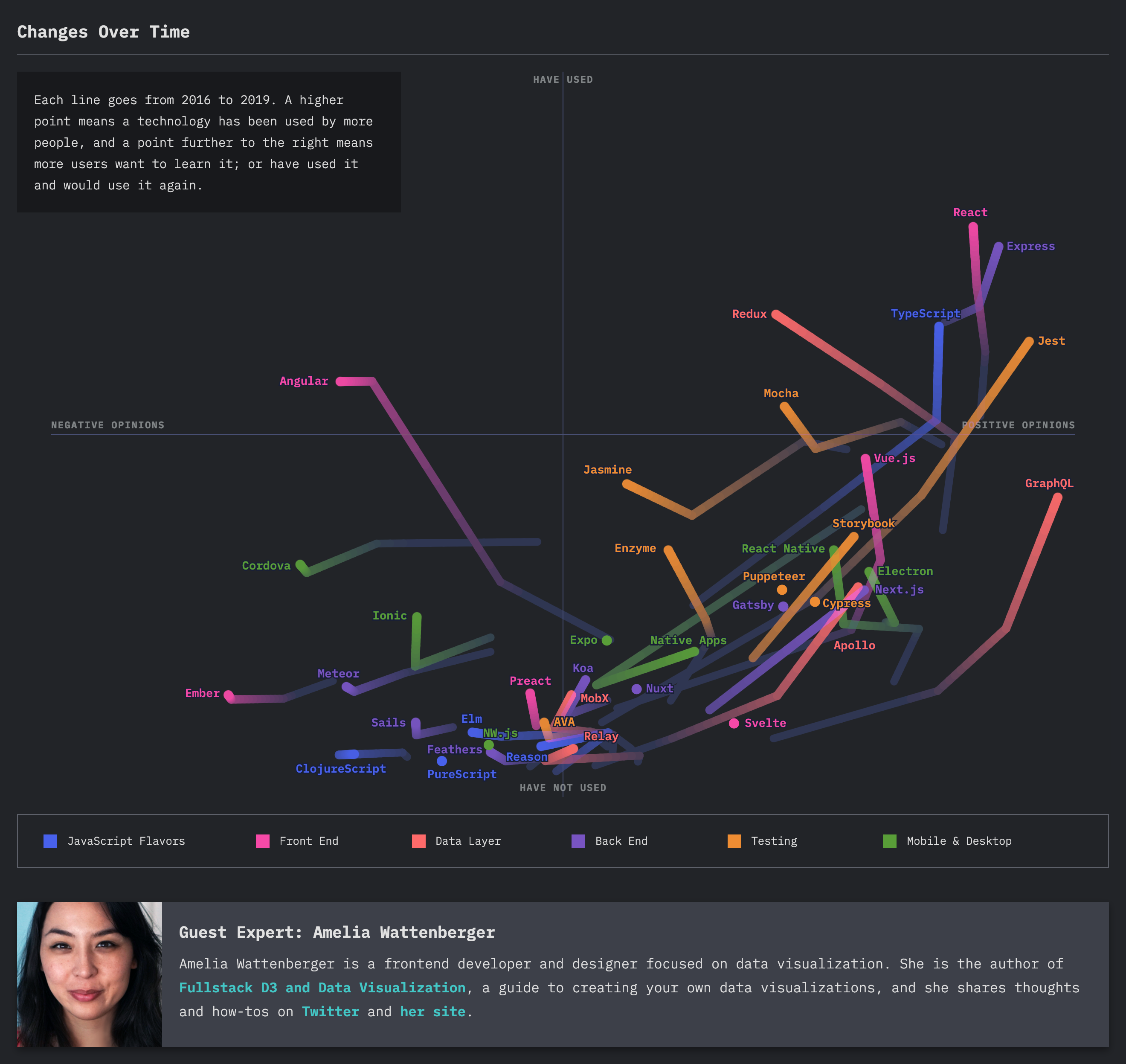
Alright, so we’ve heard a little bit more about your awesome book and some of your really cool blog posts, but I am really curious to know quite a bit more about your process for how you designed, built all of that. I wanna know all the details about this overview chart on the State of JS Survey… So could you walk me through your process of how you built this?
Yeah, totally. From the start, the main person who works on the survey - his name is Sacha Greif; he’s an awesome designer, and he always works with someone named Raphaël… I’m totally blanking on his last name, but he has this chart library called… It has a name. But he works on this chart library, and I think it’s a React chart library. I can throw a link in later… And that’s what powers all the other charts on the site.
So Sacha asked me on Twitter if I would help do some more complicated charts, just as like a guest visualizer; like you have cameos on blog posts, and stuff like that… So I was like “Yeah, totally. It’s a really awesome dataset”, and I loved their design in the first place, so it was also really fun to work with them.
So while they were collecting the survey data, I kind of had a demo dataset to work with, with maybe a third of the final responses, just so we could work on it at the same time that the survey was running… And I went through a lot of different iterations of like “Here’s the data. What can we do that would be cool, interesting and informative to people who read the survey?” So we actually came up with a lot of different options, some of which I’m kind of bummed that never made the final cut, just because they work so fast… I think this survey was closed, and four days later they published the site live; it was really impressive…
So we decided to go with one, and we wanted to focus on “What’s an easy way to get an overview of the JavaScript ecosystem?” As a JavaScript developer, it’d be really nice to have kind of a bird’s eye view of how things are going, what are the different tools and who uses them. So this project started with that goal, and what the data were. For this survey data, for every tool - and by tool, I mean JavaScript library, like React, or Redux, or Angular, or testing libraries like Enzyme or Jasmine, or React Native… So everything that people use there is a JavaScript library, I guess we’re calling a tool.
This is their fourth or fifth year running this survey, which was really impressive… So they were just coming into territory of “We can do some kind of historical analysis of how opinion of different tools has changed over time”, so we knew we also wanted to take advantage of that.
The answers for each tool - as a person’s going through the survey, and the question… I don’t know the exact wording, but the question is something like “What is your experience with Angular?” and they have five responses. Let me find the exact wording… I don’t know the exact wording, but basically, the responses were “I haven’t used it, I’m not interested in using it”, “I haven’t used it, I am interested in learning it”, “I have used it, and I don’t like it or I don’t wanna use it again” and “I have used it and I do wanna use it again.”
[40:16] That kind of data - we could do a basic bar chart of each of these tools for what percent of people cited each of these different answers, but it’s kind of hard to extrapolate across different charts where there’s like four different bars, and you’re like “Okay, this first one’s short over here, and this other one’s short, but not as short…” So I thought “How can we reduce this into two dimensions?” So I turned those questions into one dimension that is “What percent of people have used it, and what percent of people haven’t used it?” and the other dimension is “People like it or they don’t like it.”
So I collapsed across people who had and hadn’t used it, which you can argue that those are different, but like “I haven’t used it and I don’t wanna use it” and “I have used it and I don’t like it” - those are different things, but for the sake of “This is the data we have”, those are the two dimensions… So you can plot each tool on a chart where the vertical axis is further up, tools have been used more, and the horizontal axis is further to the right - tools people like more. So you can have kind of a scatterplot of each tool on that chart.
Then the thought was “How do we add a historical component to this?” and then I started with just an arrow that went through the different positions for each tool for the past four years, even though something like Svelte is new, so it only has one dot… Some of them have four dots. And I had to iterate on that, just so the lines weren’t all over each other. And I had to do some custom stuff for label placement, because if you look at the chart, like the bottom middle, there’s a lot of tools–
Yeah, “I have not used…”
…that have not been used, and people don’t have strong opinions about them… Which kind of makes sense. It makes sense that a new tool would start in the bottom middle, where people aren’t very opinionated and not a lot of people have used them… And it’s kind of cool, because you see this group movement of tools coming through the lower-right quadrant, up into the top-right quadrant, where more people – it seems like people like a tool first, and then everyone starts to use it, which is kind of interesting.
Well, I find it super-interesting that most of them [unintelligible 00:42:39.01] and then poor Angular - it’s like “Negative opinions, but a decent amount of people have used it”, and now it’s like “Yeah, some positive opinions, but no one’s using it anymore…” [laughs] You look at those outliers…
It’s almost not fair, because I think they’ll tend to drop tools when their popularity is fading. The JavaScript ecosystem has a very strong cycle of life, where tools rise and then they fall, and they were great, but you know, we’re always moving forward… So I think there are a lot of tools that would be going that direction, but they’re just not in the survey. Angular was so great that now we get to see it go leftward…
Yeah, I could be wrong, but I think there was some confusion around Angular and Angular.js being convoluted, for some reason…
It definitely could be.
Yeah. I’m not sure about the details on that; maybe Sacha can help us sort those out, but I think there might have been potentially reasons why that’s the case that it may not represent public opinion.
Yeah.
That being said, it’s worth noting that – first of all, we will embed this in the show notes, so you can just go look at it and know what we’re talking about… What’s cool is you have the different categories along the bottom JavaScript flavors - front-end, back-end, testing etc. - and as you hover your mouse over them, it focuses on that type of tool, or that subsection, and they animate it and draw in the arrows as they draw across… And one thing that you notice about the front-end frameworks in general - except for Svelte, that just has a singular point - is they’re all generally getting more popular, but then moving a little bit to the left, or a lot, in a certain cases…
[44:19] Like they all do this year…
So the more popular they get, the more negative the opinions get about them… And I think that’s just the way – you know, it’s like the old Batman… It was not in Batman Returns, but “Either die a hero, or live long enough to become a villain…” That’s just what’s happening - the more popular you get, the more people are like “Meh, I’m over you, React…”
[laughs] Yeah… I think maybe JavaScript developers are strong on using and abusing their tools…
Yeah, exactly. Well said. So once you had the idea and there’s a lot of iteration, how did you put this into practice? I’m curious, were you working in D3 this entire time? Once you said “Okay, it’s a quadrant chart, and we’re gonna have the whole left/right, top/down thing, and then we’re gonna move them over time…”, once you had the idea, were you drawing hand sketches, were you in D3? Did you use a Figma, or maybe it was the tool on iPad, where you just kind of draw by hand? What’s your process to get here?
Yeah, so usually my first step is to grab the dataset, and I’ll have either typing or writing on a sketchpad, I’ll put the main goal… Like “What do we wanna accomplish for this chart?” And then I’ll detail every single piece of data that we have within the dataset. For this one, it was each item on the right is a user, or one respondent, and then you have for each tool, we had a string of the different responses, what are the different responses that are possible…
So I’ll usually start there, just to get some kind of clarity, and then I will sketch what are the different ways that we can visualize this data? Should this dimension be mapped to color, or to a horizontal position, or [unintelligible 00:46:04.04] the size of the bubble… And then I’ll go through a few iterations that way.
Really, I should sketch more often, and it’s a goal of mine to do that more often, because I usually jump to the code… And with the code, what I really like to do - and one of the great things about this dataset was that I had the data when I was iterating on designs… Because you never really know what’ll work. Sometimes you do a scatterplot and it’s too busy, and you have to work with something else. Or it doesn’t highlight one interesting part of the dataset.
So I’ll usually go straight to the code, and something that was nice was that this State of JS website is built with Gatsby… I’m pretty sure; it’s at least with React… So I create my own React environment to work through with the dummy dataset, or a third size dataset. So I iterated a few times that way, and went back and forth with Sacha… And he came up with some really good points. It was his idea to do how the tools have changed over time. And then at some point we had to switch to a dark chart, moving it over to the actual site…
[47:23] Yeah, so it starts with “What is the goal, and what data do we have?” The middle part is like hand-sketching, and then the last part, which usually takes the most time, is iterating on different ways that we can visualize it within the browser, with the real dataset.
That’s really cool. If you guys haven’t checked out the overview chart on the State of JS Survey, I highly recommend it. Like Jerod said, we will embed this in the UI. What kind of plans do you have for the future? Do you have any fun projects that you’re working on with D3, or are you just kind of taking it easy at the beginning of this year?
Yeah, so things are really hectic right now actually, because I’m moving in a few weeks, and I haven’t announced it officially, but I’m actually moving to more of a data journalism position at a company called The Pudding.
Hm… Congrats!
Thanks. I’m really excited.
Yeah!
The Pudding, like “have your pudding/eat pudding”, or what’s it called?
Like “the proof is in the pudding.”
Gotcha!
[laughs] Which I’m really excited about, because they do really fun, interactive data viz-driven essays on the web. You might have seen - they did one with the diversity of vocabulary for different rappers… If you haven’t checked it out, go to pudding.cool. They have a lot of fun data viz essays. I’m really excited about this, because it’s both very different and not very different from my current job as a developer and designer for dashboards… Where it’s a lot of the same skillset, but also different skillsets, of like storytelling… You have to be more creative.
Wait, this is really cool… I just went to their website and they have an article called Population Mountains, how to perceive the populations of cities… And the parallax on this site - I’m gonna post this in our chat, as well as in the show notes… This is the coolest thing. So I think you’re gonna be well respected here, and you’re gonna be surrounded by like-minded people.
You’ll fit right in.
This is so cool!
Yeah, they’re a really awesome company.
Yeah, well, congrats on that new role. It sounds like it’s gonna be really exciting for you.
Yeah, I’m super-excited.
Awesome. So I personally had so much fun learning about D3, and learning about your projects… Where can people find you on the internet?
My last name is Wattenberger, and it’s never used… [laughs]
Yeah. Lucky…
So my email is wattenberger@gmail.com, which I stole from my family. My Twitter is /wattenberger. My website is wattenberger.com. Yeah, those are all great avenues if you wanna see any of the projects I’ve worked on… Or if you wanna ask me anything, Twitter is a great place, @wattenberger.
Yeah, and we will link all of these down in the show notes. Well, thank you again, Amelia. It was such a pleasure chatting with you. I’m really looking forward to see what you put out in the future, and we also wish you the best of luck at your new role.
Thanks so much! This was great.
Our transcripts are open source on GitHub. Improvements are welcome. 💚