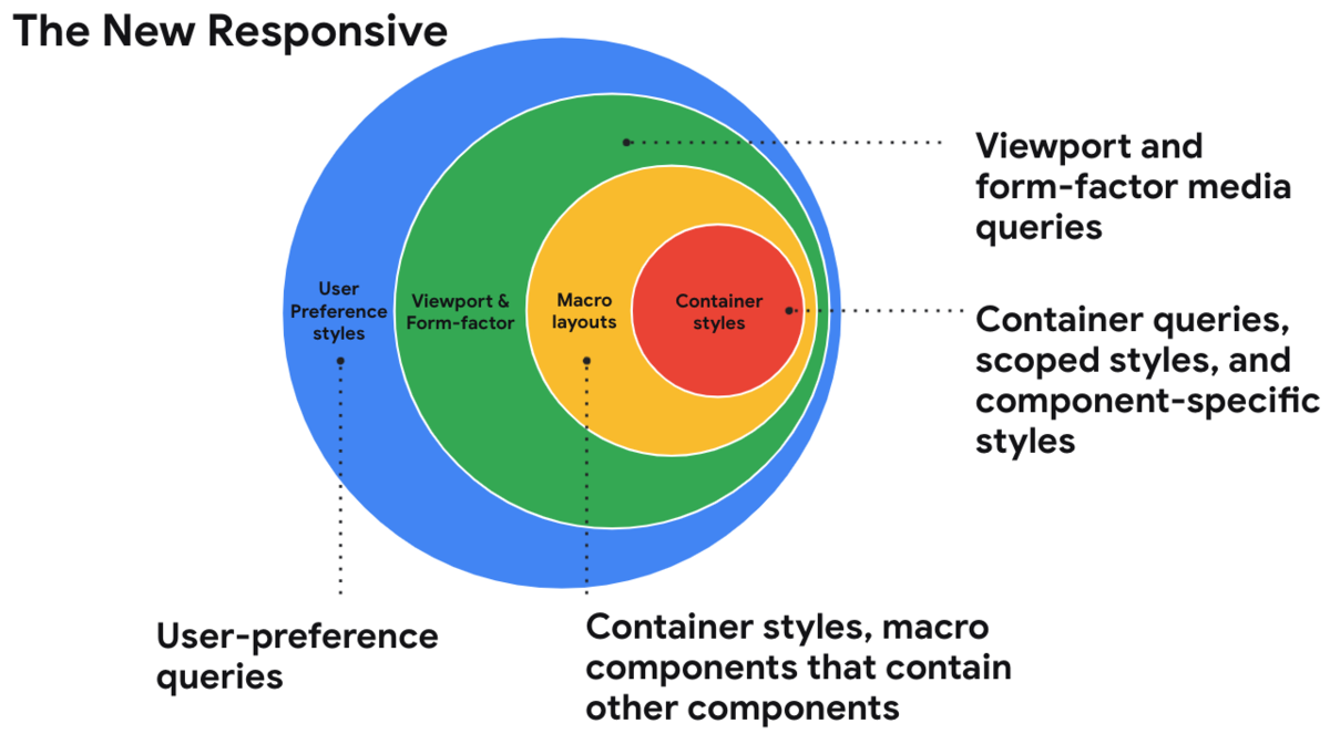
Web design in a component-driven world ↦
Responsive design is evolving. Una Kravets:
Today, when using the term: “responsive design”, you are most likely thinking about using media queries to change layout when resizing a design from mobile size, to tablet size, through to desktop size.
But soon, this perception of responsive design may be considered as outdated as using tables for page layout.
“Responsive” used to mean a web design would respond based on the size of the device accessing it. In the not-so-distant future, it will mean a web design responds to the preferences of the person, the container its placed in, and to the many form factors (including folding screens) it encounters. Exciting times!

Discussion
Sign in or Join to comment or subscribe