
Dave Gandy joined the show to talk about the history of Font Awesome, what’s to come in Font Awesome 5 and their Kickstarter to fund Font Awesome 5 Pro, and how everything they’re doing is funneling back into the forever free and open source — Font Awesome Free.
Featuring
Sponsors
Code School – Learn to program by doing with hands-on courses. Save $10 per month! Sign up for Code School for only $19 per month by using our special URL codeschool.com/changelog.
Linode – Our cloud server of choice! Get one of the fastest, most efficient SSD cloud servers for only $10/mo. We host everything we do on Linode servers. Use the code changelog20 to get 2 months free!
Rollbar – Put errors in their place! Full-stack error tracking for all apps in any language.
Notes & Links
You can always add more sprinkles!
- Font Awesome
- Font Awesome on GitHub
- Font Awesome Issues on GitHub
- Support Font Awesome 5 on Kickstarter — make sure you watch that video too!
- Dave said the video he created for Font Awesome Black Tie should be an example of what not to do.
- Fort Awesome — Like Font Awesome. But Better. Build and manage icons and typefaces in a single place, then serve them with a single line of code.
- Rob Madole on Twitter
- Travis Chase on Twitter
- Brian Talbot on Twitter
- Videopixie — Find great videographers, directors, video editors, and animators to work with you on your project.
- Half Baked was the set for the Font Awesome video
- Knox Avenue did the production of the Font Awesome video
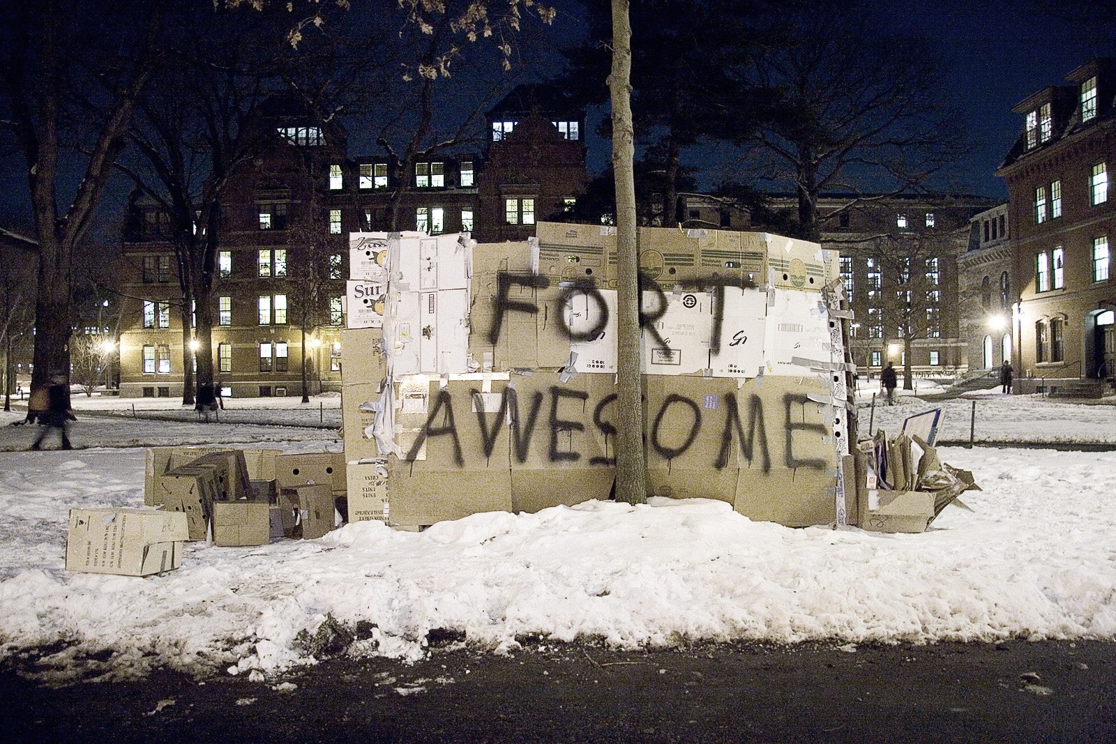
Below is the photo Dave mentioned when telling the story about the origins of the “Fort Awesome” name (listen at around 24:40).
Transcript
Play the audio to listen along while you enjoy the transcript. 🎧
Welcome back everyone, this is The Changelog and I’m your host, Adam Stacoviak. This is episode #226, and today I went solo talking to Dave Gandy, the creator of Font Awesome. You’ve seen it, you know it, you love it, it’s awesome. Font Awesome 5 is here, kind of. It’s on Kickstarter right now, just over $500,000 in backing. I talked to Dave about his beginnings, where Font Awesome started, where it’s going, where it’s been…
We have three sponsors today - Code School, Linode and Rollbar.
Alright, we’re here with Dave Gandy. Dave is the creator of Font Awesome. I’m riding solo on this show, Jerod is not here today, but Dave, what’s up? How are you?
Hey, how’s it going?
So Font Awesome… I mean, you’ve got “awesome” in the name, how awesome is that?
Yeah, that was a very fun part of the naming process, how the name turned out, that’s for sure.
This is not a new project - and I have to apologize too, because the Changelog’s been around for a while; we’ve wanted to cover Font Awesome at least a couple of times, and it’s just never made it past the us getting in contact with you mile marker, but you’re now getting ready to version from 4.6 to 5. You’ve got a Kickstarter out there, you’ve got a lot of fun stuff happening, but this isn’t a new project… How far back does this go?
This traces back about four and a half years now to a startup I was working at ages ago, still with my co-founder, Travis Chase. I was working on our company’s website and I was grepping and complaining about how bad icons were and how hard they were to use. You’d have to bring them into Photoshop, you’d have to individually color them, then maybe you had to deal with some png sprite maps - it was just kind of a mess.
Oh, yes.
And there were some other folks that were doing some really interesting things with icons as fonts, but they had some problems around accessibility. I started digging around, continued to grep and complain, and Travis, in his usual fashion, told me to shut up and solve the problem myself. That’s where Font Awesome came out of.
[03:45] Wow. I mean, nothing better than a project like this with the years – I mean, I know so many people and so many websites that use Font Awesome. That’s in and of itself a tribute back to what you’ve done here. The best thing when you scratch your own itch is you scratch this problem that’s like, “This is really bugging me. How do I solve this problem?” So your co-founder/buddy Travis is who pushed you to do it, is that right?
Yeah, it’s kind of funny how the world works out sometimes… Travis and I actually are childhood best friends, 25+ years.
Wow!
So we go waaay, way back. We both are from a little tiny town called Carl Junction, Missouri. A big shout out to everybody there who’s probably listening to this.
Oh yeah, a thousand people maybe. Two thousand people in the town.
Four thousand one hundred and twenty-three, or so the sign said outside of my house where I grew up.
Gotcha. Okay, cool.
But we grew up together. I went off to school up in Boston at MIT, and spent a lot of time around the startup community there. Travis stuck around Carl Junction, married his high-school sweetheart, and about six or seven years ago now I figured out that Travis had quietly become the best software developer I knew on earth.
Whaat?
Yeah, it’s really funny how that worked out.
How did he do that on you? He didn’t tell you? He didn’t say, “Hey, I’m trying/doing this…”
No. I mean, I knew that he was a developer, I just didn’t know he was that good. Once I figured that out, we’ve basically been working together professionally ever since.
Wow. One thing we like to do on this show is get a history. One history with this show might be the Font Awesome history, but the other history might be to a certain degree what you’ve just shared there - your history. You mentioned that you and Travis were childhood best friends, he secretly became this awesome software developer, but what’s your history? You said in the pre-show - I don’t know if I should say this for you, but you’re more of a designer than developer.
Yeah, it’s definitely true, I think. Well, you know what? I’m not really either one truthfully; I kind of sit in this weird half world. I think most real designers think I’m a developer, and most real developers tend to think I’m a designer.
See, we always are so self-deprecating as people, right? My wife calls it negative self-talk, and I do it to myself all the time. We haven’t done it yet, but we have this set of sub-taglines that kind of define who we are here at Changelog, and one of them is “not an impostor.” I think you’re not an impostor. I think you’re exactly who you are. I think you’re both a designer and a developer, and you can claim both roles.
I think the truth is for me – where it really goes back to is sort of a general outlook on life. Icon font’s the natural restrictions inherent in that medium - I’m not an illustrator by any means, but the natural restrictions of designing at a very small size and trying to make it readable was pointing to my strengths. Like I said, not an illustrator, but I can handle that particular set of constraints really well. The truth is Font Awesome actually came out of a personal journey of mine in trying to figure out after college this whole world of who I actually was. I think a big part of that is we in the world spend a lot of time worrying about our weaknesses, things that we’re bad at.
That’s true.
And the truth is I think we get a lot more traction in general in life and a lot more satisfaction out of worrying about our strengths instead, playing to our strengths. There was a point at which I realized that the worlds I really love to live in - I really love to live in these intersections of art and technology, the left brain/right brain, where both are required.
So Font Awesome sort of just naturally came out of that particular adjustment in my own personal philosophy on life. I think that everyone is a unique and diverse set of strengths. If we will play to those strengths of ours, I think there’s so much that gets unlocked by us when that happens.
[08:03] So take us back - you said you were in college… What’s your story there? When did you become or not become a designer, or become or not become a developer? What was the thing that sort of pulled you into this intersection, as you mentioned?
For undergrad at MIT I studied Mechanical Engineering, and I really always gravitated towards product design specifically. I found that the place where I really excelled there was in the common sense, robust approach to engineering, and design is really a lot of that. Design is really thinking about the natural restrictions in the medium, in the people that you’re designing for the situation, and trying to really think on behalf of those individuals how to best tackle the problem in the simplest, most robust way possible.
At the time, all of my jobs happened to be in software, but I’ve always had a passion for arts and design, and it really came in a move out to Los Angeles - I spent a couple years in Los Angeles - and being around the arts and such creative people really brought that side of things back to life. Always very passionate about technology and art, but it was really that re-awakening, that sort of is where real emphasis on product design specifically came from.
So all of my jobs were in computers at the time, and it just sort of gravitated that direction. Instead of physical product design, I started focusing on digital product design, and there were so many parallels… At the time, the industry was well far behind physical product design. With physical products there was a very good process established for user-centric design, and it wasn’t really until Apple came out with the iPhone that it became really an industry-wide sort of thing, where people really saw in software how much design and the interface really mattered.
Yeah, it seemed like the iPhone really did wake up a lot of people that user experience matters. I know it seems so simple to say it’s just a phone, or whatever, but that company really helped shape and change people’s minds towards what a good product actually is.
Yeah, it really did. And for me personally, my career trajectory shifted from feeling like I was talking to a brick wall at software companies when I was talking about the design…
…because they were like, “What is that?”
Yeah, exactly. “What’s the priority there? Look, we’ve got this machine that prints cash, I don’t need why we need to worry about that.”
Okay, let’s get closer to the beginnings of Font Awesome. You mentioned that it was scratching your own itch… I’m actually surprised - I don’t know your history, so that’s why I’m surprised; not so much that you’re not worthy of this, but that you have a background at MIT, studying Mechanical Engineering. What brought you into that field? What made you think that that’s where… I guess, what got you to MIT? You must be pretty smart.
Yeah, I think people tend to think that until they get to MIT, and then everybody thinks they’re below average once they get there.
Right. They’re like, “Uhm, I’m actually not that smart. I’m trying to be really smart.” This is a place where you get smart.
Yeah, and the one thing that’s really true is that MIT is good for nothing if being good for your ego. That is a really good place to figure out… And figure out a little bit of who you personally are and your own identity.
Right.
There’s a big path actually even taken through my time at MIT, but I think originally for me… I mean, gosh, I grew up playing with legos when I was five years old. My parents got me the original Lego castle. I just always liked making things, always liked building things. So when it came time to go to college, it was really just about, “Where can I keep doing that? Where can I learn from people that know how to do this? Where can I build?”
[11:55] I’m the kind of guy that’s always been… I’ve never really enjoyed learning for its own sake, I’ve always really enjoyed learning for doing’s sake. And truth is, when I was in fifth grade I saw a PBS special about these kids at MIT building these robots, and they had this contest to see who can get the most ping-pong balls. That was really the time at which I was just fascinated by that. But as a kid from Missouri, it still wouldn’t have been something that I would have even thought of as a possibility at all. I think a lot of times kids don’t even realize the possibility and just how attainable so many things actually are, but I was lucky enough I had a couple of teachers who had – and again, this is in the middle of nowhere in Missouri, but I had a couple of teachers who had kids who went to MIT. I had another teacher who really understood the whole college admissions process, and so what wouldn’t have been even possible really came about because of a few relationships in my life.
We have similar paths, to a degree. The similarity is not MIT - I didn’t go there… But the similarity is definitely a small town and an uphill battle to get to where you’re at today, because that’s my story. I grew up in – I don’t often tell this on the Changelog, mostly because Jerod and I are together and we’re kind of focused on the guest, but in this case we’re kind of sharing some stuff here… I grew up in this small town in South-Western Pennsylvania called Maxwell. You probably can’t even find that on the map. It just doesn’t get there unless you zoom all the way in - that’s when it matters, when you’re all the way in on the zoom.
I grew up poor, I grew up in a place where opportunities weren’t handed out. It was very much a blue collar-type area. Everyone around me was blue collar, and all I knew was blue collar. I never thought that I would be where I’m at today, and it was only by people around me influencing me every step of the way. Those influences were all unique in their own right, but it was all those incremental influencers throughout my life that got me to where I’m at. It seems somewhat similar to your story.
Yeah, I think that’s true. I think one of the real key things for me in my entire life is just the value of other people, and not just for the benefits you get, but for in and of themselves, intrinsically, for their own uniqueness and who they are. Travis and I grew up with a third friend of ours, Ryan. Ryan ended up going to MIT the year before I did. Not a lot of kids from our high-school really ever went anywhere out of state for college, so it was kind of a big deal that he blazed that path. So Travis and I and Ryan grew up really good friends, and it’s just strange sometimes how life works out where you’ve got good people around you that just rub off and become such good, positive influences. It’s especially strange when it happens for the rest of your life.
Me and Travis, we still get together on a pretty regular basis and still see each other pretty often.
That’s very cool. So let’s fast-track a bit to Font Awesome. We’re gonna take a break here in probably a few minutes, but I wanna tee up what the core topic is here - Font Awesome 5 is where you’re at now. You’ve got a Kickstarter out there, you scratched your own itch to get here – what was it, five or six years ago that this started?
I think it was March of maybe 2012 when we first released Font Awesome.
Okay, four years and some change. This is a widely used project, this is an open source project; I’m not sure yet of the stability in terms of money, sustaining or employment; I know you have Fort Awesome, which I thought was actually a ripoff, and now I find out that you’re actually behind it. I had no idea that you were, so we’ll break that open as well.
Absolutely.
Help us understand what Font Awesome is. Give us the breakdown there, and from there we’ll go into our first break.
[15:59] Font Awesome is really a set of icons that everybody needs for their website. It helps you to easily put social media icons, maybe an up arrow, a Home icon or a hamburger menu - it allows you to easily put that on your website and then style them the same way you would style with regular text. Font Awesome is the same size, the same color, the same drop shadow of the text around it, so you already know how to change it and how to style it.
As a bit of a bonus, it’s also vector-based, so no matter how large you make those icons, no matter if you’re on retina or not, they’ll be perfect.
This has come around too in an age where I think retina was just becoming more and more popular around 2012. I think version 3 or version 4 of the iPhone was the first retina, and even then you had the iPads that weren’t retina yet. I remember having a non-retina iPad and being like, “Oh, I’ve gotta have a retina one, because I think it’s so clear to see.” That’s where it really matters to have vectors, scalable, font-based, same size, those kinds of things for icon clarity on a website.
Yeah, it’s really interesting. We got really lucky with the timing of a lot of what we were doing. Retina was a huge, huge thing. We obviously had nothing to do with retina, but we happened to have a product that was already sitting out there that would meet those needs really well.
So that wasn’t on purpose? That was sort of like by accident in a way?
No, that one was definitely not on purpose, that was largely by accident. I think part of it was just the inherent superiority of vectors and design making it so easy to change it that retina was just a fallout of a lot of the other advantages that packaging icons into a typeface gave you.
So here you are now, you’re on – Font Awesome, by the way, if you’re still catching up, as I kind of am as well. It’s on GitHub, it’s an open source project, you’ve got to date 46,000+ stars, almost 8,000 forks, so people are forking this, making their own, submitting a pull request, things like that. There’s lots of people watching this - almost 1,200 watchers. The question before we go into the break is why open source? Why was that the way for this? Because it’s been open source since day one, right?
Yeah, it’s been open source since day one. I think a big part of it is just kind of growing up with a mentality and learning as a designer - and somewhat as a developer - having benefitted from open source so much… I didn’t see this as a business opportunity at all - that’s not really my background at all - so it just seemed obvious that this would be an open source thing.
We were doubly scratching our own itch here, because we were using an early version of what back then was called Twitter Bootstrap (now it’s just Bootstrap). The icons that they were including at the time were all raster-based. You’d have to pick the white color or the black color; they didn’t scale up, and they were a little brittle, but they were nice and really small size. We decided for that first version to include every single icon that Twitter Bootstrap included, except for ours would be vector, they would be the same color as everything around it and would be really easy to control.
Between that and retina coming out, we got really lucky in terms of the timing of other products that happened to be out there, for where Font Awesome’s success came from, too.
That’s definitely a good place to break then. We’ll come back and talk about that luck, so to speak. So let’s break here, and we’ll be right back.
Alright, we’re back from our break with Dave Gandy, creator of Font Awesome. It’s open source, by the way, so you can go to fontawesome.io, check that out. At the top is a link which we haven’t really talked about much yet, it’s the announcement of Font Awesome 5, specifically the Kickstarter; it’s a link to the Kickstarter. We’ll talk about that here in a bit.
Dave, before the break you mentioned right place, right time, being lucky - what do you mean by that?
I think in life a lot of times it’s sort of obvious that in order to get somewhere that you wanna go in life, that you’ve gotta be persistent and you’ve gotta work hard. I think that’s something that our community and the startup world in general is really acutely tuned into. That hard work - you’re not going to get good results without hard work, but I think the thing that the community has a hard time with is this notion that maybe it’s a combination of hard work and luck; it’s not one or the other, but it’s a strange mix of both. That’s definitely true in my case.
It’s interesting, we’ve been trying to start a company out of Font Awesome. We’ve been through a lot of iterations and a lot of different things, so it’s really cool to see the Font Awesome 5 Kickstarter doing really well, but there’s a lot of hard work that goes into that.
In terms of luck, there are so many things that can’t be attributed to your own hard work. I think that it’s a little bit disingenuous sometimes to do so, but you’ve gotta have both. You’ve gotta have, for the really disproportionately sized success, you’re gonna have hard work and you’re gonna have luck. And you’re not gonna get nearly as much luck without a lot of hard work, but I think they really go together.
When I think about this project, some of the things you just said there was you had some iterations where you’ve - I’m not sure the exact words - to a degree tried to be successful or tried to turn into not so much a business, but sustainability, to some degree.
Yeah.
I don’t know if that equates to just simply making money or what not… We’ll get to your Kickstarter in a bit, but I just wanna tee this up saying that currently you’re nearly half a million dollars in backers, when your original request was just simply $30,000.
Let’s not go into that yet, but just for the listeners - if you haven’t gone to the Kickstarter yet… A half a million dollars. What I wanna talk about here is how this began as an open source project, how you wanted to give back because you had already gotten so much back from open source; you were in the right place at the right time, you called it luck, you talked about retina becoming a thing, you talked about Twitter Bootstrap, the icon set there where they were rasterized, they weren’t scalable like Font Awesome made available - right place, right time, whatever.
Let’s talk about Font Awesome specifically, getting to the piece where… What were some of the things that you tried to do that I guess made it to what it is now? Not so much now, but like with the Kickstarter - you’re trying to make money, you’re turning it into a business of some sort, a money-making product that is also open source and has open source roots. Give me some of the fails and successes, the bloody knuckles along the way. What were some of those things for you?
[23:43] A couple years ago Travis and I were working together at a different place, and Font Awesome in those first two years had just continued to grow at a rate that we couldn’t really ignore anymore, so we started talking about “Maybe this is a way for us to continue to get to work together.” For me a lot of the motivation of starting a company is getting to work with the best people on Earth that I’ve ever met. I don’t just mean professionally, but as human beings, too. I’m unbelievably proud of the team here that we’ve got at Font Awesome - of Travis Chase, of Rob Madole and Brian Talbot. We have a really stellar and spectacular team, and I think for us that’s the foundation of a lot of this - continuing to work with great, spectacular, amazingly talented people. The business is sort of a vehicle for that, truthfully.
Some of the things that we’ve tried along the way - we’ve got what I think is a fantastic service called Fort Awesome. If you actually at the GitHub repo itself, the organization is Fort Awesome and the project is Font Awesome. That was always sort of a play there. Fort Awesome - the name itself comes from an old episode of news radio, a funny little very memorable scene there. Every place I had lived up until that point in life I just referred to as Fort Awesome.
When I was living in Boston I’d walk through Harvard Yard on my way to the subway a lot of the times, and at one point somebody had built this cardboard box fort in the middle of the winter, and it spray-painted “Fort Awesome” on it. So I have this spectacular photo from that as well, it’s actually hanging in our office on the wall right now. It’s out there, it’s somewhere, you can probably track it down.
Fort Awesome was always the original organization that produced Font Awesome, and Rob was the one who came up with the idea of “Instead of Fort Awesome, what if you called it Font Awesome?” That’s really where the name itself comes from.
So Fort Awesome - we originally launched as a service called Fonticons. Basically the big idea there is that just like Helvetica is not the only typeface that you need on the internet - it’s great and it’s spectacular, but it’s not the only one you need. Maybe you need a different look, a different style, a different feel to it. And we feel the same way about icons, as well. Font Awesome is great, but sometimes it’s not the exact look that you need, and there are lots and lots of phenomenally talented icon designers out there, so Fort Awesome is our attempt to bring a lot of those icons together into one place.
On the site you can mix and match your perfect icon set from the styles that you are looking for; you can upload your own, you can actually serve typefaces and imagines from there as well, too. That’s been actually our big focus for the past several years on building out Fort Awesome.
So is Fort Awesome - let’s just put it in quotes here - “successful”?
I think it’s not bad. It’s not anything that’s going to employ four of us over the long term for the time being, but it’s definitely enough to continue to invest into. I still think that that’s where the puck is going eventually. I love Font Awesome, but I think sometimes the style isn’t perfect for your website all the time, and you might need something else.
I also think that performance is a huge deal, and just serving the individual icons that your site needs really helps out with performance. When every second of load time cuts your conversion - whatever that conversion is - by 7%, that’s a… Performance is really a lot more important, and I think sometimes we prioritize it.
We’re talking about fails, successes, things that you’ve done along the way to iterate on essentially sustainability. How did these two play together? You’ve got Fort Awesome, you’ve got Font Awesome. Fort Awesome is the overarching org, it’s the LLC or the company that owns the copyright to Font Awesome?
Yes, it is.
[28:01] So as products, how do they parallel one another?
Yeah, so really Font Awesome and Font Awesome Pro will be individual typefaces in that broader service. The way this is gonna work is for everybody who supports the Kickstarter, if you’re also a Fort Awesome customer or you become one, you’ll have that entire set automatically added to your library of icon sets, so that you can use all of that to piece it together. You can also upload your own logos, your own individual things that we may not have in the sets or that you wanna be a little bit different.
Coming back to open source, why do you think open source is the catalyst – or do you think open source was a catalyst for this popularity that you couldn’t ignore anymore?
I mean, truthfully, if we had made Font Awesome commercial from the get-go - and it was definitely an option to think about - I think we would have just been spending a lot of time trying to make money off of it and it would have just been kind of a distraction.
I completely attribute its being open source to its broader success, but there’s a lot that we don’t have time to do on Font Awesome. There’s a lot of great things that we want to add to it, so that’s really where the Kickstarter came out of. Font Awesome right now is about 675 icons as of its last release, which was 4.7, and we actually released 4.7 the same day that we launched the Kickstarter, because we wanted to make it clear to the community that we’re still very much focused on the open source and the free version of Font Awesome. That’s where our roots are, and that’s never going to change.
That said, our repo has many thousands of open issues on GitHub with icon requests. I attribute that to the reason that we just got the numbers from GitHub that last year Font Awesome had more contributors than any other open source project. Full stop.
We had more than anybody else, and I think that’s because there’s a real strong desire for so many different icons, but if you look at a lot of those requests, they’re not necessarily something that a lot of people have, but it’s a very strong need for a small set of people. That’s where we got this idea for Font Awesome Pro; our stretch goals for every 25 grand that we raise, we make another icon set. We make another icon pack based on a specific category, and for every one of those categories we add ten of those to Font Awesome free, and then we’ll add another 30 to Font Awesome Pro.
This was really a way for us to completely blow out the sheer number of icons before we really knew how great that demand was gonna be. So far we’ve got 21 additional icons packs funded, and that’s 21 in addition to the six that we were already planning for Font Awesome Pro. So 27 total icon packs, around 40 icons a pop in there - that’s a lot of icons.
On the open source front, I’m kind of curious as part of this catalyst, since you agreed with my term there…
Absolutely.
Because that’s what it seemed to me. Had Font Awesome not been open source, it wouldn’t have become what I would personally consider as this standard for icons on the web; maybe even in terms of their implementation, or being a font now, with the new version offering SVG, the accessibility things you’ve done over in 4.6, the way you implement those in CSS and ultimately support pre-processors like LESS or SASS, or what have you. I’m curious how the actual icons themselves, the libraries got supported and influenced by the open source community.
I know you’ve got - and I don’t even know how you deal with this - but you’ve got 3,700+ issues on your repository, so that’s tons. You’ve got almost 6,000 closed, but what’s been the community’s impact towards new icons? How does that play?
[31:56] As a matter of fact, the community itself is primarily what drives the new icons that we make in every single version. We typically take a look at the most requests icons and we’ll just go off the list. The last release we did, there’s a handshake icon that’s been sitting there for far too long. I’d actually tried to design it on three separate occasions and it’s just a really hard icon to design and make it readable in all sizes, but that had about 300 upvotes, and we haven’t got to it yet. So a lot of our issues that are really requested by a lot of people, they may only have a hundred upvotes, and we don’t have time to get to it.
Another part of the problem that happens when you’re completely lead by the community is that you end up with some sort of patchy support. You might have one handshake icon that’s not outlined, one that is… You might now have all of the right matching icons in a particular theme, because if you’re doing individual requested icons, you sometimes miss that holistic picture.
Right now we’re adding icons primarily based on what the community is asking for specifically, so Font Awesome 5 is gonna give us a chance to go back and really consider the larger picture, specifically around these themed icon category packs.
When you say patchy support, do you mean technical support for sure, not so much technical like “I’m going to help you” support, but more like technical in the font style or the icon style of technical, meaning that the actual icon you implement may have slight variations from variation to variation, basically?
Absolutely. For instance, a lot of icons in Font Awesome will have a solid version of the icon, they’ll have an outlined version; they might or might not have a version with a circle behind that object, or a square, or an outlined square. Along the way we’re missing a few of them here and there, because as we did them one off, we didn’t consider the entire system of how these work.
The new version - for every icon we’re gonna have a solid version that’s in Font Awesome free, and then in Font Awesome Pro there’s gonna be an outlined version. We just hit the stretch goal recently to develop a thin outline style as well for each one of those icons. So there’s really a lot that goes into those different styles, and having them all match and all be visually very cohesive, so that when you put two very different icons next to each other, they still sort of feel like they go together.
This seems like a very time-intensive project, would you agree with that?
Oh, absolutely. I was just looking at the number so far, and we’re redesigning every single icon in Font Awesome free from scratch, and all of the stretch goals that we’ve hit so far. It takes us on average probably an hour to design every icon, so we’re looking at probably a total of 3,000 icons so far. That’s gonna take a little while. It’s very, very intensive, and the thin style - it’s possible that we could just change the weight and not really redesign the icon at all, but in order to get pixel perfection and in order to really get it on retina as well, every single one of those thin icons is gonna need to be redesigned. It’s not just a variant of the regular outline, it’s gonna be completely redesigned, as well.
The reason why I asked about time intensivity is because with this many issues, with this kind of community interaction, with this kind of success built upon open source, the free time from so many people out there giving back to this project, to its success, leading to where it’s at - that’s a lot of time to do. And I’m thinking how in the world, if you don’t find ways to sustain, which is something we always try to come back to, especially when you have a project like this that really requires so much time, not just from you and some other core leaders, but some of the community, as well. How do you get to a point where you can actually keep giving your time without feeling like you’ve been overburdened, or where you’re like, “Man, I’ve got family, I’ve got friends, I’ve got a life, I’ve got work…” How do you keep giving to this?
[36:10] I say that to probably get to, hopefully, what might be the next layer for this, which is Font Awesome 5, the Kickstarter, and all the things you’re doing to get to the point where you are at right now.
Yeah, it is a good bit of work, and there are a lot of people that have been really helpful along the way. One time I noticed on GitHub that there was another guy out there that was just really nicely and politely responding to issues. He was letting them know the expectations we have for contributing guidelines, and just being a really awesome community member. And we asked him, “Hey, do you wanna take on a more official role?”, so Jeremiah’s the guy that typically handles a lot of the day-to-day issues on the Font Awesome GitHub repo, and I tell you what, that guy is prolific and he is unbelievably appreciated. There’s a lot that’s gonna go into continuing to keep Font Awesome 5, continue to keep that free version update and excellent.
But a lot of it is – if we can figure out a way to eat, we can basically figure out a way to keep this alive and keep this growing. That’s exactly what the Kickstarter was really about - Font Awesome has gotten some great success, but it looks like what people really want more of is more icons. We’re just not going to be able to get to the 3,000 requested icons on there, so maybe we can figure out a way where we can make that work. Maybe we can figure out a way where everybody can get involved in this.
The Kickstarter has done so much better than we expected; we had our original early backer goals for the first week, and we just opened those up to everybody for the rest of the Kickstarter campaign, so that everybody can get Font Awesome Pro for $20.
Wow. I saw that, and I was like “That’s really awesome”, to give the community a way to… Because there’s no one out there saying, “Hey, I wanna keep using Font Awesome totally for free, Dave. You’ve broken your butt off, and the rest of the community… Just keep doing what you’re doing, with no way to, as you said, eat, or no way that this is helping you eat. Keep racking up those issues, keep giving me this free stuff” - no one wants to say that. Everyone out there who’s ever used Font Awesome to some degree wants to find some way to give you something to keep making this project awesome… Which is a great pun there for this.
Now that you’re talking about the Kickstarter, let’s talk about that. So $20 is the opening goals, or pledges…?
Yeah, on Kickstarter they call them pledges. The first pledge at the very top is for $20, and that gets you the early backer price for Font Awesome Pro, which we extended to the rest of the Kickstarter. That license for Pro is an individual license or a small business license that covers up to a hundred people at a company.
That’s a lot.
We try to make it really flexible, honestly, where it would be something that would be cheap enough that everybody could use, and flexible enough in how it’s used. Trying to count based on the number of designers that are in your company or the number of computers that it’s installed on - I think that’s kind of hard to keep track of, so we’re trying something new that we haven’t seen before, a way just to keep it simple.
What that license gives you - originally we were planning on having only a thousand more icons in Font Awesome Pro, and a full SVG framework. This really allows us – like I said, we’ve got 21 stretch goal icon packs that have been reached; that’s gonna be another 700-800 icons right there. Who knows how many there will be before the end of it…? Every $25,000 that’s raised, there’s another icon pack. Everybody gets that particular stretch goal, and we’ve got lots more stretch goals going on, too.
[40:06] We’ve got a set of duotone icons. This one’s really fun. I’ve been itching to do this one technically for a while. You can obviously do it with SVG, but you can also do it with icon fonts, as well. Basically, for the top 200 most popular icons in Font Awesome - we’ve got data from tens of millions of websites, so we actually know which icons people are using most, and we’re gonna pick the top 200 of those, and we’re gonna separate that out into layers. We’re gonna have one layer that’s full opacity and one layer that’s 50%, so that you basically can continue to get all of the ease of use of Font Awesome where it’s the right color, but the other layer’s gonna be 50% opacity, so you get this awesome duotone multicolor effect.
Yeah, kind of like a layered effect even.
Yeah, that’s the first stretch goal. I’m gonna be writing about our process for how we make this icon set. Designing icons is a meticulous business, so we’re putting out an eBook - we’re gonna collect all the blog posts that we’ve put together for this into an eBook and distribute that. We’re making design plugins for sketch Illustrator in Photoshop. When we hit the $300,000 goal we decided to put basic SVG support into Font Awesome 5 free, so that we’re giving back not just to the people who are supporting Pro, but to the whole community along the way as well.
Font Awesome free will have – all of those icons will be bare SVG files. You can use them in your sites if you want that way, or you can use them a little bit more easily on the desktop. We’re doing an icon subsetter, where you’ve got a desktop tool that will allow you to select just the icons your site is using, and we’ll make those files for you.
You can also reach within icon style as well… So we’ve hit so many stretch goals so far, and we really wanted to pace these out so that everybody wins along the way.
That’s good. I just realized we’re getting close to our next break. I wanted to dive deep into Font Awesome 5 and the Kickstarter, but we’re gonna have to do that right after this break. We’re got two more stretch goals you didn’t mention there, so when we come back from that break we’ll go into the next two, which is iOS and Android support, and this last one, which is Font Awesome Pro CDN. We’ll take this break real quick, we’ll come back, we’ll dive even further into the Kickstarter, Font Awesome 5 and these two additional stretch goals we haven’t covered yet. We’ll be right back.
Alright, we’re back from the break with Dave. We’re talking about Font Awesome 5 and specifically this Kickstarter. I mean, $30,000 as the initial goal… I wanted to ask you, was that a true real goal? Did you really think you’d only do $30,000? This half a million dollars right now with 29 days to go - is that a complete and utter surprise to you and the rest of the team?
I’ll tell you the truth, I think we were hoping for more than $30,000, but we were gonna make Font Awesome 5. We asked ourselves, “What’s the number that we’re making it anyway?”, so we really would probably have made it anyway, but we wanted a goal that would be sort of reasonable, that we’d be perfectly happy to do all this work, even if that’s all that was met. So that was really how we came up with that number.
We took the tail end of that last break talking about the different stretch goals, and I think what’s interesting to just clearly mention in case it wasn’t clearly enough mentioned by you is that each of these stretch goals are things that help you have more money to make sure that you all have the time and employment to be able to do this stuff, but it’s also giving back to the open source project, which is super cool. Each of these stretch goals listed on your Kickstarter campaign are not just self-fulfilling for the people paying for them, but also feeding back into the open source, open license version of this.
Getting back to the two stretch goals we didn’t mention, which haven’t been met yet, but the next one is close to being met… You’re like maybe $45,000 away from your next stretch goal, which is the iOS and Android support, which means that you’re gonna have iOS and Android… You’re gonna be able to easily use Font Awesome Pro in those two different platforms. Then you also have Font Awesome Pro CDN. What are these next two stretch goals?
These two stretch goals we’ve been talking about for a couple of days now. Originally, the first set of stretch goals that we had made were blown through in less than a day, so we had to come up with a second set. Those have been completely passed through as well, so this is our third set. We’ve got a couple more up our sleeve, but the two here that we’ve got listed right now are iOS and Android support – the idea behind this is that we’ve got a lot of people who use Font Awesome in mobile apps, and we wanted to make that just that much easier for them to use it.
Another piece of that is when we meet that goal we’re gonna open source that same support for Font Awesome free as well. Basically, anybody making a mobile app will be able to use Font Awesome free completely easily, and not have to worry about anything.
For those that pay for Pro, you’re gonna get access to all those extra icons for making your next mobile app.
[48:14] And the CDN, I noticed that you’re also a user of MaxCDN; we love MaxCDN. I think they recently changed their brand to StackPath, so I’m not sure how you’re changing your mentions back to that, but we’re huge fans of Fastly around here. Our podcast is served by Fast, so a quick mention of that… But what is the CDN? What is this piece here?
This really comes out of another project of ours. About 4-5 months ago we launched something that we called Font Awesome CDN. It’s completely free, and that bandwidth is all provided for free by MaxCDN. MaxCDN has really been there for us particularly from the very beginning. Justin Dorfman specifically was such a huge champion for developers…
We love Justin around here.
Such a good guy.
He’s awesome.
Yeah, another one of those guys that I just cannot speak highly enough of. So Font Awesome CDN - the notion of that really was we wanted people to be able to do things like update their version of Font Awesome without having to push any code. So you give us your email address, we send you a unique code that you can put in your website, and if you ever wanna change it later you can come back in and update the version, you can turn on something that we developed that we’re really proud of, that we called Auto Accessibility, and you can control async, you can actually do CSS or JavaScript… There are so many different things that you can do with that.
So Font Awesome CND - completely free to everybody to use. Really the idea there was that’s been such a helpful thing… So many people have signed up for that and are using it actively that we wanted to do something very similar for Font Awesome Pro. Now you can download the files, but then you’ll have to serve them yourself, which for a lot of people really isn’t a problem, but that’s not everybody who uses Font Awesome, so we wanted a solution that was just as easy to use as Font Awesome CDN was.
If we reach that goal, we’re gonna give everybody access to a year of Font Awesome Pro CDN, so that they can easily serve up their icons. And we’re gonna make it easy for them to just load the specific icon packs their site is using, so that they can keep their pages small and fast-loading, because we know how important that is.
This comes back to that icon subsetter where you can just choose the ones you’re using and then obviously serve them, not so much from your own disk, from your own server, but from the CDN that you’re providing with Font Awesome Pro CDN. It says Font Awesome Pro CDN in the stretch goal - is it Font Awesome CDN, or is it Font Awesome Pro CDN?
It’ll be the same underpinnings of the way that we’re doing Font Awesome CDN, but it’s specifically for serving up Pro. Since Pro is a commercial icon set, we wanted to make it have a way where it was really easy… Other commercial typefaces might get served up with Typekit, or a similar service.
Right. So it says there “We’re giving all Pro backers a year of service”, so those people that back a that $20 level, that initial level, they’re gonna get this once you hit this stretch goal. It’s like that first initial pledge of $20 keeps getting sweeter and sweeter as the amount goes up in terms of this Kickstarter.
Yeah. I mean, that was really the idea here. We’re engineers and we’re designers, so the success of this has been really such a fun thing for us, to basically think about all of those problems that we know about and we hear about and have for ages, and now we’ve got a way to fund a lot of those solutions. That’s what’s been really fun. Font Awesome Pro CDN I’m particularly excited about.
[51:56] The icon subsetter is really designed for our real tweakers, our developers there who really have a lot of time to be able to spend on performance. We wanted to do something a little less granular with being able to load just the icon packs. The subsetter, you can choose individual icons; Font Awesome Pro CDN you’ll be able to pick the major icon packs, so that even people who may not be able to handle some command line tools very well will still be able to keep their website pretty slim and speedy.
Let’s talk about this video. I don’t know how you did it, I don’t know if this was… I wanna know the intentionality behind this thing because this video alone is reason enough to give you $20. I mean, I don’t even care if I get Font Awesome, I’m so thankful for the creativity behind this… I wanna know the story.
Kickstarter, they lead with a video. If you don’t have a slammin’ video that tells your story in the most compelling way - and that varies by project - then you may be just dead in the water. But in my opinion, you absolutely grand slammed this thing. This is, by far, the coolest, best video for Font Awesome. I didn’t expect it. I thought it was you as the main character for a bit because I saw the pixelated Dave and I don’t know you personally, so I haven’t seen your face, so to speak, besides the avatar you carry around. I may have seen a picture of you, but I don’t know all your characteristics, so I thought this was you. What is the story behind that video?
If you wanna see me and you wanna see just how bad a Kickstarter video is that I starred in, go look at our old project called Font Awesome Black Tie. It was a different looking icon set that came in multiple weights. That’s me on that video; I’m just dangerous enough with a camera, with an SLR, to be able to shoot a decent video, and that’s what it looks like when we do it.
So we learned pretty well last time that, “Oh my goodness, this is not our wheelhouse. We’ve gotta have somebody else look at it.” And I gotta say, we did Y Combinator last summer, and the community of folks at Y Combinator are just so helpful and so spectacular. Another one of the Y Combinator startups called Videopixie is a place where you can go and you basically give the details about your project and then all of these professional editors and writers and people who shoot the video can basically bid on your project. So with some help from Thomas there at Videopixie we found a company called Knox Avenue; they’re in Los Angeles and they are just some of the most phenomenally talented people you can ever expect.
We were originally looking at Sandwich Video. Sandwich Video - you’ll see them out there for a lot of big name projects. I think Slack has a video made by Sandwich… They produce absolutely amazing content, but their prices these days start at a quarter of a million dollars, because they’re just really good.
A lot of money, yeah.
A lot of money, but you know what? If you’ve got it, they are spectacular. So honestly, Knox Avenue is probably just as good, but they’re just not famous yet. They’re a little younger…
I don’t… After watching the video, let’s say not “just as good”, I would say “as good”, for sure. I’m familiar with Sandwich Video, I love them too, but I think that this video is by far phenomenal. They did a great job doing this for you.
Thank you. I mean, we had so much fun writing and being out there for the shoot… It was great.
It was in Burbank, right? You said it was in California…
Yeah, this particular bakery, which I don’t even know how they found this place… I could not imagine a better place to shoot. That’s not a set, that’s an actual bakery, and it’s just gorgeous naturally, and it just on camera so well… It’s called Half Baked, and they’re in Burbank. The place is just gorgeous.
[56:00] So I went out there for the weekend, doing the shoot, and in typical low-budget Los Angeles starving actor style, the shoot started at 6 PM and it went until 6 AM. These people there, they’re used to it. There were probably 20 people between the actors, the extras, the director of photography… There were just so many people and so much stuff going on, and these guys are so talented and so good, and we had so much fun trying to put as much personality into that script as we could.
We’re huge nerds… Everybody at Font Awesome, we are huge nerds, and we really enjoy just trying to put that in every little corner of everything that we do, and the script and the video is just really kind of an example of that.
I love how it opens up and it’s like, “You can always have more sprinkles…” The opening alone was enough… It is amazing. And now that you said Half Baked in Burbank, the bakery there, I went ahead and scrolled back to 1:06 roughly in the video where he is - I forget the guy’s name, on the outside - like “You changed the recipe.” He’s like, “No, we didn’t change the recipe.” It’s like this angry customer outside and he says it again, “You changed the recipe!” “No man, we didn’t change the recipe, you know that”, and he kind of gets sweet and he kind of calms down, but in that shot you can see Half, and the B of Baked, and you can kind of see their logo in the window. They made a cameo of this, that’s pretty cool.
And the guy who starrs in the video, Rob Michelsen, he ad-libbed so many little bits and pieces in there that we didn’t have originally in the script, and he’s just so funny. That part at the beginning, the “You can always add more sprinkles” bit, that was him ad-libbing.
Oh, man… It was so good. I made a note of that, I was like “I wanna mention that.” “You can always add more sprinkles.”
Yeah, Rob was absolutely spectacular. And my other favorite secret star in the video is a guy named Albert, who was just such fun to hang out with that whole evening. He’s the baker. He’s the guy at the very end, sort of dancing in the background, and he shows up throughout the video in random places, but he is my favorite little secret, hidden thing in there. He’s spectacular, too.
So maybe this isn’t exactly pertinent to Font Awesome 5, but I think this just shows to your level of commitment and your attention to detail, is the stellarness of this video. And while it may not be you and the Font Awesome team particularly shooting the video, editing the film, doing all the script writing, that you had a phenomenal team to work for this and do this with you, it’s just so good.
When I watched it for the first time, the first thing I said to the Changelog team, I was like… You know, because Justin was coordinating this call with you and helping us meet up with you and help telling your story, and I went to the Kickstarter of course - the first thing I did was watch the video, because that’s what you - and I was just like, “You’ve gotta check this out. The video is amazing!” And we have our own films piece to Changelog here, called Changelog Films, and we like to do fun stuff, so we always love to see people get creative with film. So I was immediately hooked.
I don’t know anybody else out there who feels the same way I do, but if you go to the Kickstarter and you see this video, it’s by far… I love how it talks about the staleness of version 4, so again it’s some negative self-talk, some self-deprecation there… That was three years ago, version 4 kind of got stale. How did it get stale? Well, this and that… And it kind of names all these different things… I think the video is awesome. I’m kind of rambling, but the video is awesome. I love it.
[59:57] Thanks. I think the first time that Travis saw an early cut of that video - this was before a whole lot of work was even finished on it - he was nearly in tears. When it was all done, he said “You know what? That video may be the best thing we ever do.” At that point I was like “Alright. I think we’re doing alright here at this point.”
I got one more thing I want to mention, or to talk about in depth, which shouldn’t be at the tail end, and I’m sorry that it is, but it’s the SVG framework you talked about. But before we go there, I wanna ask you one thing on this front - is the measure of the cost of the video… This is pre-Kickstarter, so this is like “initial investment”, so to speak. This is you banking on having to do something capitalistic, your own capital into it, to get to the point where you can actually say “Hey world… Here we are, here’s our plan. Come support us.” Was it scary to make that choice?
It was a little bit. We’ve taken a small amount of funding over the past few years, and we really are really conscious about trying to stretch that as far as possible. The video was cheap for what we got, but there was a good bit of money that went into that. So yeah, it was definitely a nerve-wracking thing to put this much up, for a company that we didn’t know personally, for Knox Avenue to shoot this for us and help us write it. But I’ll tell you what, as soon as we started working with them it just became obvious that not only was this gonna easily be worth our money, this was just gonna be better than we could have ever hoped. We’re just really happy with how things turned out.
Real quick, what was their name again, so I can make a note of it for the show notes?
Knox Avenue Films.
I’m gonna add it to the show notes before we move onto the next topic.
Knox-Avenue.com
Cool. We’re gonna add that to the show notes, so if you wanna call them to work on your project… Now they’re famous, if they weren’t already famous.
I’m sad that this is the last thing we’re talking about, but the SVG framework - what is this…? Is it something that will be its own open source repo? What’s the story behind it? You mentioned eBooks and blog posts earlier, but what is this SVG framework that you’re talking about?
The SVG framework… So the $300,000 stretch goal was to put basic SVG into Font Awesome free; so all those SVG files are gonna be there, they’re gonna be really easy to use individually… The idea behind this framework is there are some great advantages to SVG, but they’re a little trickier to work with. Once you have it figured out, it’s great and you’ve got a great system going, but for some people it’s a little more complicated than Font Awesome is, which is dropping a single line of code in your website and you’re good to go.
So we wanted to take that same ease of use of Font Awesome and bring it to SVG. If you want your icons to be the same color naturally as the text that’s next to it, there’s some good stuff you can do. But we also wanted to be able to do things like size and drop shadow, and a lot of those additional CSS features that you also get with icon fonts, we wanted to bring that same ease of use and that same power to SVG. So that’s really our vision behind that SVG framework, which is a part of Pro and is for all of the Pro backers.
Is this something that needs a repo, or is it simply a way of doing things?
There’s gonna be enough code behind it… In order to pull it off, we’re gonna need some bits of JavaScript, so Rob Madole, our local JavaScript master is gonna be doing a good portion of that. It could have its own repo, that’s possible, but I think it will just be a part of the Font Awesome Pro repo. Something that we didn’t mention is that for everybody who’s a backer we’re gonna have a private repo, where everybody can have access to the code and they can follow along in our development, our alpha, beta pre-releases - all of that along the way, people can follow along.
We’ll be getting input from people on the specific issues, on which icon categories we’re developing all along the way, so the code for that is gonna be in that same repo.
[01:04:18.06] Earlier you mentioned that you’ve got a couple more things up your sleeve in terms of stretch goals… Maybe tease us. Can you share some stuff here with the listeners? What’s a stretch goal that isn’t listed that may be listed? What are some ideas you have?
The reason that a lot of these aren’t listed there yet - and there’s a little bit higher dollar value on them - is because they’re gonna take a lot of effort for us to do well. We don’t typically like to do projects that we can’t just phenomenally well… So one of those that I’m really excited about is a community website. It’s basically a place where everybody who’s a part of Font Awesome can go and interact, help us vote specifically on icons; we can use GitHub to be able to do voting on icons, but it’s not the greatest interface.
We also wanna make it easier for people to have access to the latest versions, and have a forum where people can help each other out. Really a more dedicated place that we’ll hang out at and that we’ll answer questions on as well, where the entire community can get together and help each other out.
You mentioned you had something up your sleeve - what I think is interesting is it seems that all these stretch goals were borne back to the open source piece of this, back to the community mentioned; it’s sort of like deep in these roughly eight or nine thousand issues between the closed and the open, so I’m assuming that most of what you’re pulling out of this hat you’ve got is from what the community has already asked for. This four-ish years of history is playing to the future benefit of this Kickstarter, and it will also play into the stretch goals that you’re creating.
That’s absolutely true. We listen to everything people say, positive or negative, and we internalize that. You’re exactly right, that’s where all of these stretch goals are coming out of.
Aside from going to FontAwesome.io and clicking on the banner that shows up at the top for the Kickstarter and going to learn about that, and potentially becoming a Pro backer at $20, it’s still open source, so you don’t have to pay to play… What are some ways for Font Awesome collectively as the open source piece, what are some ways the community can step in and help out? I know you’ve got so many issues… You mentioned Jeremiah earlier, how that person was playing a great role just naturally in issues, and he kind of graduated to a role that was a bit more formalized… Things like that - where can people listening to this that absolutely love Font Awesome, loved hearing this story of yours and are just thinking, “Dave, Travis, and the rest of the team, how can I step in and help out?” What places can they go to do these things?
The issues there… The more that people help out, the more that they kind of know the community and help out there naturally - that is absolutely so unbelievably helpful. Jeremiah does so much work on that, and we’d love to be able to give him a little bit of help out there. I think there are some other places too, there are Stack Overflow issues that we never get to, and if people wanna start helping out with those… There’s really just so many places that people are asking for help on Font Awesome we just don’t have time to get to; those are really, really helpful for us.
Some of it might be helpful to get the word out about Kickstarter. The more that we are able to do with the Kickstarter, the more that we’re able to put back into Font Awesome free and into Font Awesome Pro. That’s a huge thing for us.
[01:07:45.00] There are places also where companies can get involved helping out. One of our rewards that we’ve got on here is folks can get their company logo added into Font Awesome free and Font Awesome Pro. There are really ways for everybody at a lot of different levels to get involved, where they can all give back to the community.
I think it’s interesting that thing with your logo on Font Awesome free and Pro, because it’s a form of marketing, it’s a form of support, so it’s a form of donation - you give a little, you get a little, so to speak, as a company… Let’s say there’s a very large company out there, 50 million users using Font Awesome either as a base for the icons they’re creating, or just straight up using Font Awesome - this is a way for them to honor the open source piece of this, your time, Travis’ time and the rest of the team’s time, making this possible, and also the community’s time, triaging these issues, supporting the community, helping out, being helpful, writing documentation, caring about accessibility - which is something we didn’t get to talk about; we’ve only got two minutes left, so we can’t… We could if we really wanted to, but…
It’s in there… Check out Auto Accessibility and check out all the accessibility changes we made in 4.6; we’re really proud of those.
Yeah, that’s in version 4.6. This is a way for those companies to go to Kickstarter and say, “You know what? I’d like to get a little and give a little.” That’s really awesome, I like that.
We’ve got two minutes, so tell me more about the accessibility. I know that this is really important for dotcoms in general, because when we redid changelog.com recently, one of the things that we ran into with some of the things we had done - we had done some branding around what we call “sub-brand”, so to speak, so podcast, films, news, things like that. When we rolled that out into the design, we had some issues where… Well, it’s an icon, it doesn’t say what it is, so can you give me kind of the high-level overview of accessibility and what it means to you for Font Awesome, but specifically how you implemented it in 4.6?
Yeah, and let me first shout out… The reason that 4.6 was able to have such great accessibility improvements is it was another place that the community got involved. We had so many folks who know so much more about that world than we do, and we kind of threw the issues, we were able to get so much feedback on them that we’re really happy with where it came.
The big thing on icons is are they of semantic value or are they just decorative? If they’re just decorative, all you’ve gotta do is throw in aria-hidden=“true” tag on the icon and you’re good to go. If they are semantic, there’s some extra stuff you need to do, and we added some more support for that. If you’re using Font Awesome CDN, we have a feature called Auto Accessibility, that all you need to do on the icon if it does have semantic value is throw a title on it. If this represents hours left or time of day or whatever, you throw title = time of day, and then the screen reader will see that.
We really tried to make it as simple as possible. I think a lot of the times the reason people don’t get accessibility right, like me, the reason is because they just don’t know. There’s so many things to know about it, and it’s unbelievably important to do well, but sometimes it doesn’t pop the priority stack for folks, and that’s why we wanted to invest as much as we could to make it as easy as possible, so that your icons on your site are accessible to everybody.
That’s awesome. We all need that, we all care about accessibility, and I think it’s awesome that you made it a priority too to implement it in 4.6, and also the different… There’s a stretch goal too that adds to it; you said there’s a new font pack coming around accessibility, is that right? Or there was one in 4.6, but there’s more added.
Yeah, that was another piece of 4.6. Now we’ve actually got a full set of accessibility-specific icons to represent a full gamut of what’s needed there, so definitely check those out. That was another thing that we got a lot of feedback from the community on, to make sure we were doing it right.
[01:11:56.03] Very cool. We got to actually a lot of stuff about your history, about Font Awesome’s history, about where this is going, the Kickstarter, the video and everything in between, but I may have missed something. If I missed something, this is your chance to share it. What would you like to share with the community before we tail this show?
I think so much of just a complete and total satisfaction in life comes from the people that you surround yourself with, so I cannot thank enough the team that we’ve got at Fort Awesome, for Travis Chace, Rob Madole, Brian Talbot - those guys are just spectacular.
I cannot speak highly enough about those guys, and I am so, so - lucky is not exactly the right word - but to be working with those guys, they are absolutely spectacular.
I would put our team before, up against any in the world to ship and deliver useable software on time.
That is awesome. That is very awesome, and I think the best way to close this might be just to simply say, “You can always add more sprinkles”, right?
Always.
Always add more sprinkles. Well, Dave, it was a pleasure to meet you and have this time to chat with you, talk through this big piece of your life, this awesome open source project, the next phase of it, Font Awesome 5, the Kickstarter, and I still can’t believe… I’m gonna go back to the tab real quick here before we tail off - the interface is live updating, and you’re right now at $456,000, as of the recording. We’re recording this on 1st November, mid-afternoon roughly; you’ve got 29 days to go.
We’re gonna put the link to this Kickstarter in the show notes. If you’re just listening now, go to the show notes, go to FontAwesome.io, there’s a banner at the top whether you’re on mobile or desktop, you’ll see that; click that, go to the Kickstarter, watch the video first, because you have to, but keep in mind also the goal that you’re at.
I think it’s just phenomenal to see this kind of support, and just to see this kind of success for this project for you, and then what it’s gonna actually do for the community, so congrats to you and the team.
That is it for this show here, so I wanna say thanks to all the listeners tuning in - you’re awesome, we love you. Justin Dorfman, dude, you’re awesome; thank you for the hug at All Things Open, thank you for connecting us to Dave and the story, and helping us connect with him and share this story. We think that more people need to hear your kind of story, Dave. What do you think? You’ve got a pretty awesome story, right?
I definitely appreciate hearing that.
You don’t think so?
I don’t know, I don’t know.
I think your story is awesome.
I think the truth is that everybody’s got a story inside of him.
That’s true. And that’s us, in a nutshell. We believe that everybody out there has a story to tell in open source, and developer, designer, impostor, not an impostor, self-deprecating, negative self-talk, whatever you do, dude, you’re awesome, and I thank you for all you’ve done here. Listeners, we also thank you for tuning in. Dave, that is it for this show, so let’s say goodbye.
Thanks for having me on the Changelog. I’m really humbled to be in such good company, I really appreciate it.
The feeling is mutual, Dave. Thank you.
Alright, have a good one.
Our transcripts are open source on GitHub. Improvements are welcome. 💚