A color palette generator for the design 'impaired' ↦
This “Data Color Picker” looks like a spectacular tool for any developer out there (like myself) who appreciates the value of a good color palette, but lacks the ability to put one together. You’re not alone!
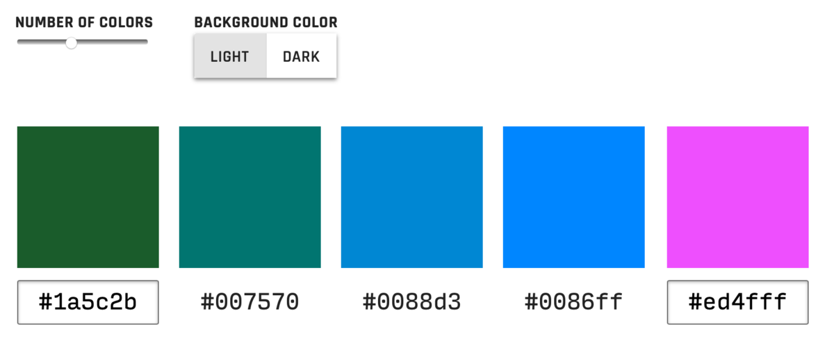
(This tool is for generating equidistant palettes for data visualizations, but it can most certainly be used generically.)
Creating visually equidistant palettes is basically impossible to do by hand, yet hugely important for data visualizations. Why? When colors are not visually equidistant, it’s harder to (a) tell them apart in the chart, and (b) compare the chart to the key. I’m sure we’ve all looked at charts where you can hardly use the key since the data colors are so similar.
You pick the “endpoint” colors and it generates all of the colors in-between. Very cool.
Discussion
Sign in or Join to comment or subscribe