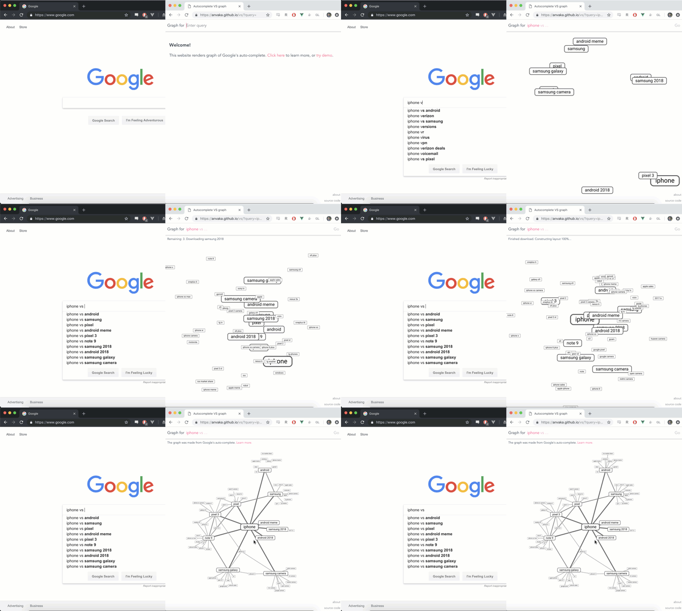
Visualizing Google's autocomplete as a graph ↦
Cool idea: take Google’s autocomplete suggestions, repeat the same query on them, take those suggestions, repeat the same query on them, and then draw a line between each suggestion. This could be useful for market research, to find alternative solutions, or simply for curiosity’s sake.

Discussion
Sign in or Join to comment or subscribe