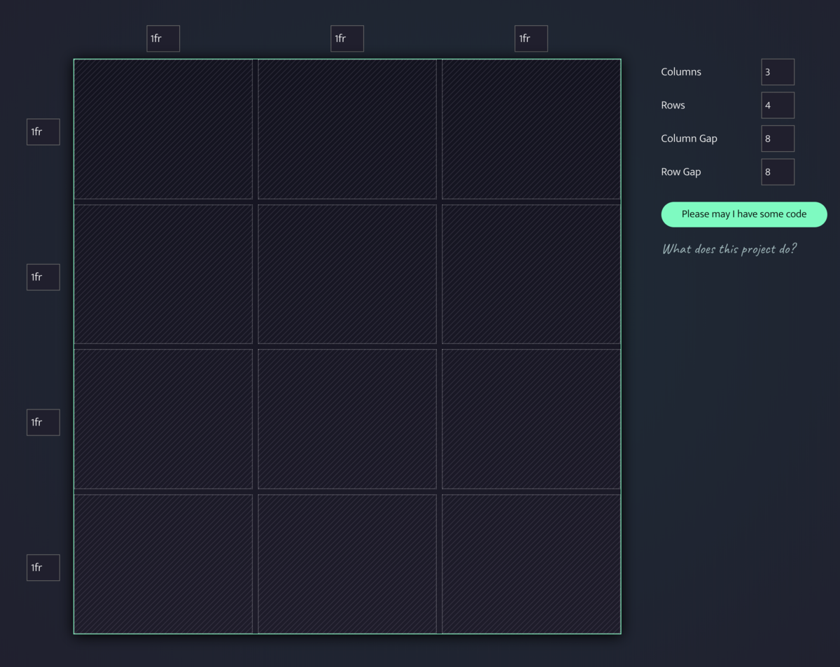
CSS Grid generator
Huge thanks to Sarah Drasner for creating and sharing this with the world!
Generate basic CSS Grid code to make dynamic layouts!
Huge thanks to Sarah Drasner for creating and sharing this with the world!
Generate basic CSS Grid code to make dynamic layouts!
If you’re a tmux user, but you’ve never heard of tmuxinator… it’s time to fix that. Simon van Dyk has a solid intro to it on Thoughtbot’s blog:
tmuxinator is a ruby gem that allows you to easily manage tmux sessions by using yaml files to describe the layout of a tmux session, and open up that session with a single command.
I’ve been using tmuxinator for years and highly recommend it. 👌
Adam talks with Erik Kennedy about tactical design advice for developers. Erik is a self-taught UI designer and brings a wealth of practical advice for those seeking to advance their design skills and learn more about user interface design. We cover his seven rules for creating gorgeous UI, the fundamentals of user interface design — color, typography, layout, and process. We also talk about his course Learn UI Design and how it’s the ultimate on-ramp for upcoming UI designers.
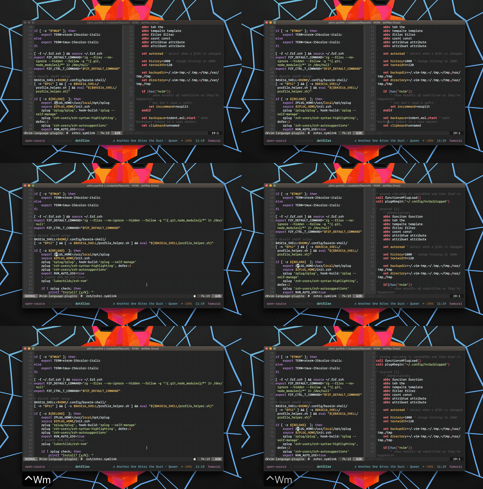
As an avid vim + tmux user, <prefix>-z
is an essential tmux command to zoom the current pane for the times I want to see my editor or command output at its maximum size. The vim-zoom plugin brings this same concept directly into vim by adding a <C-W>m
mapping that will zoom the current split to be full screen. Triggering the mapping again brings back the original pane layout, making this an effective tool when needing to focus on a specific split when necessary without losing your splits layout!
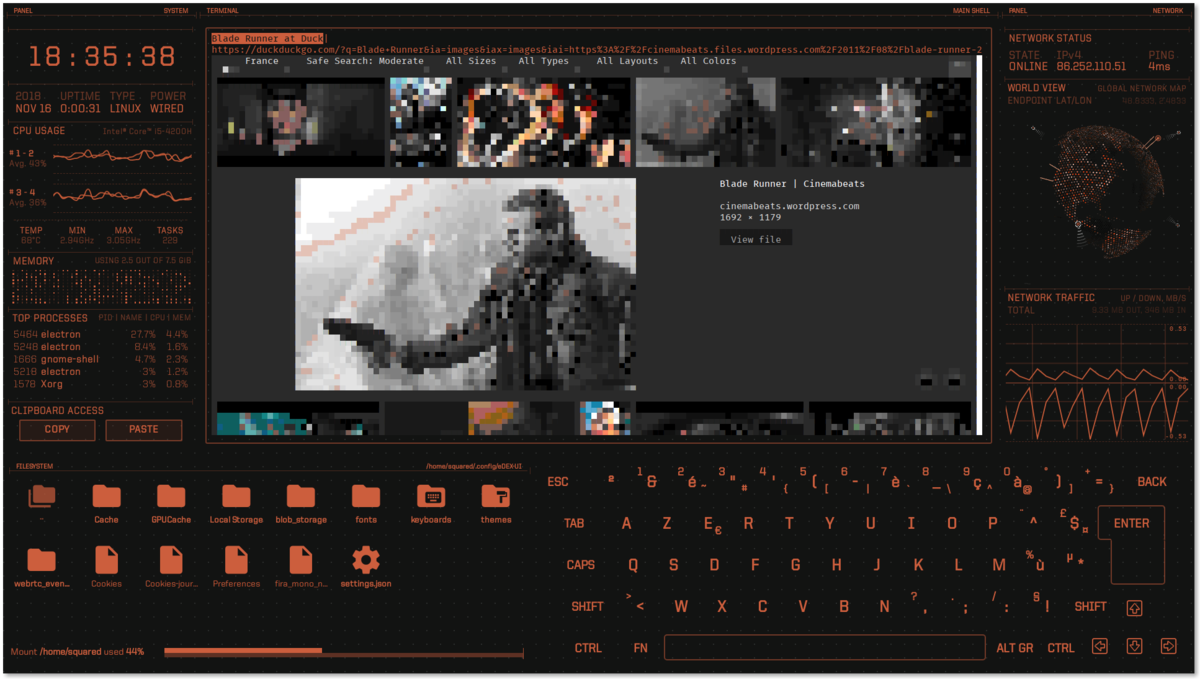
It runs the shell of your choice in a real terminal, and displays live information about your system. It was made to be used on large touchscreens but will work nicely on a regular desktop computer or perhaps a tablet PC or one of those funky 360° laptops with touchscreens.
If the colors and/or keyboard layout aren’t to your liking, you can customize it to the hilt following these directions in the wiki.
Our goal with Guess.js is to minimize your bundle layout configuration, make it data-driven, and much more accurate! In the end, you should lazy load all your routes and Guess.js will figure out which bundles to be combined together and what pre-fetching mechanism to be used! All this in less than 5 minutes setup time.
That’s an excellent goal! But how will that work?
During the build process, the
GuessPlugin
will fetch report from Google Analytics, build a model used for predictive pre-fetching and add a small runtime to the main bundle of your application. On route change, the runtime will query the generated model for the pages that are likely to be visited next and pre-fetch the associated with them JavaScript bundles.
The tool was announced at Google I/O back in May, but as of today it’s still in alpha.
Chris Coyier on CSS-Tricks:
Say you have a very simple CSS grid layout with one column fixed at
300px
and another taking up the rest of the space at1fr
.…
That’s somewhat robust. That
1fr
column will take up any remaining space left behind by the fixed300px
column. It’s true that theauto
value would do the same, butauto
isn’t quite as robust since it’s size is based on the content inside.
Chris explains something here which may look pretty simple, but would’ve taken me hours to debug. The distinction he makes between the 1fr
and auto
defined column is game changing on its own.
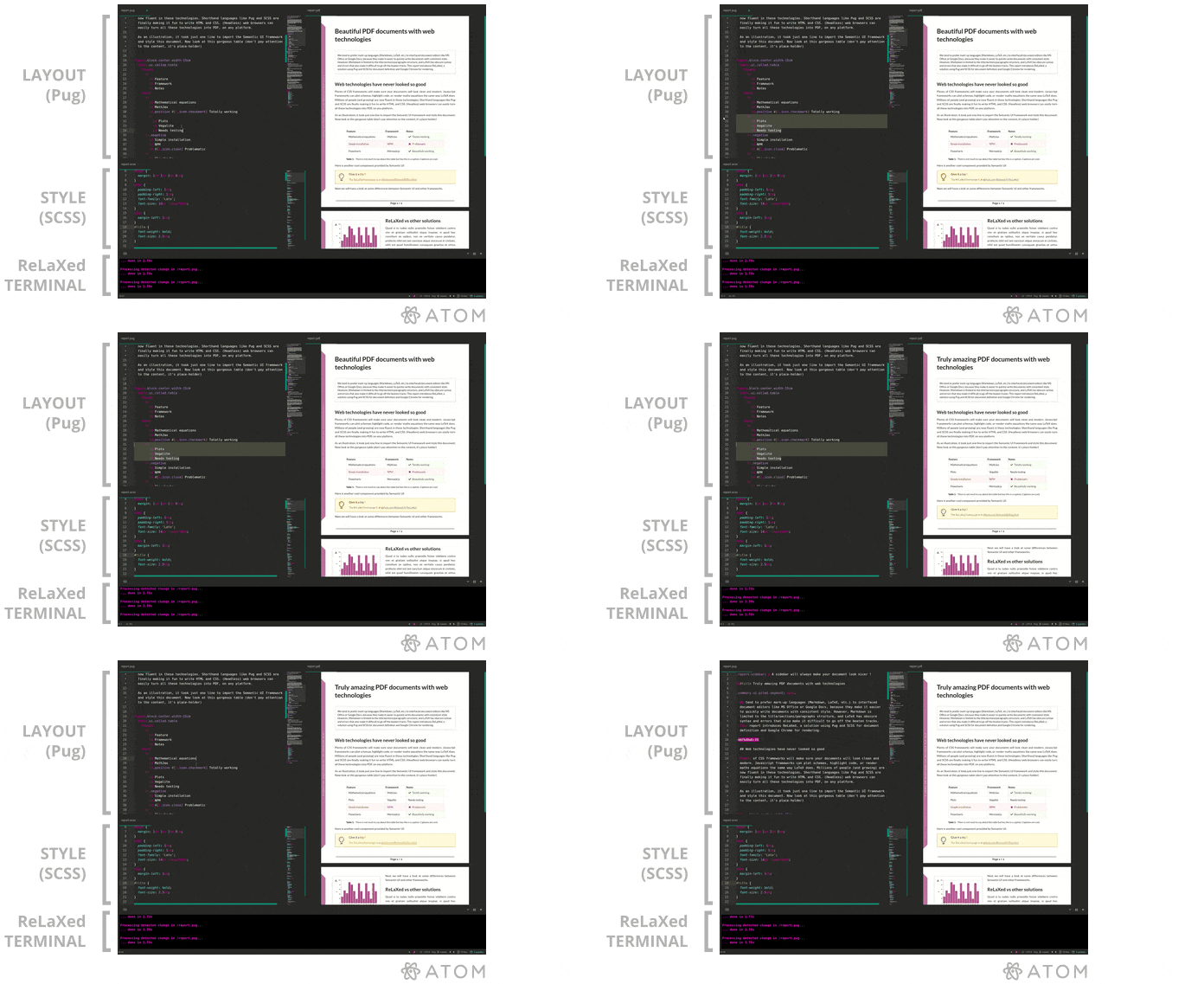
It allows complex layouts to be defined with CSS and JavaScript, while writing the content in a friendly, minimal syntax close to Markdown or LaTeX.
Lots of nice output examples in the README.
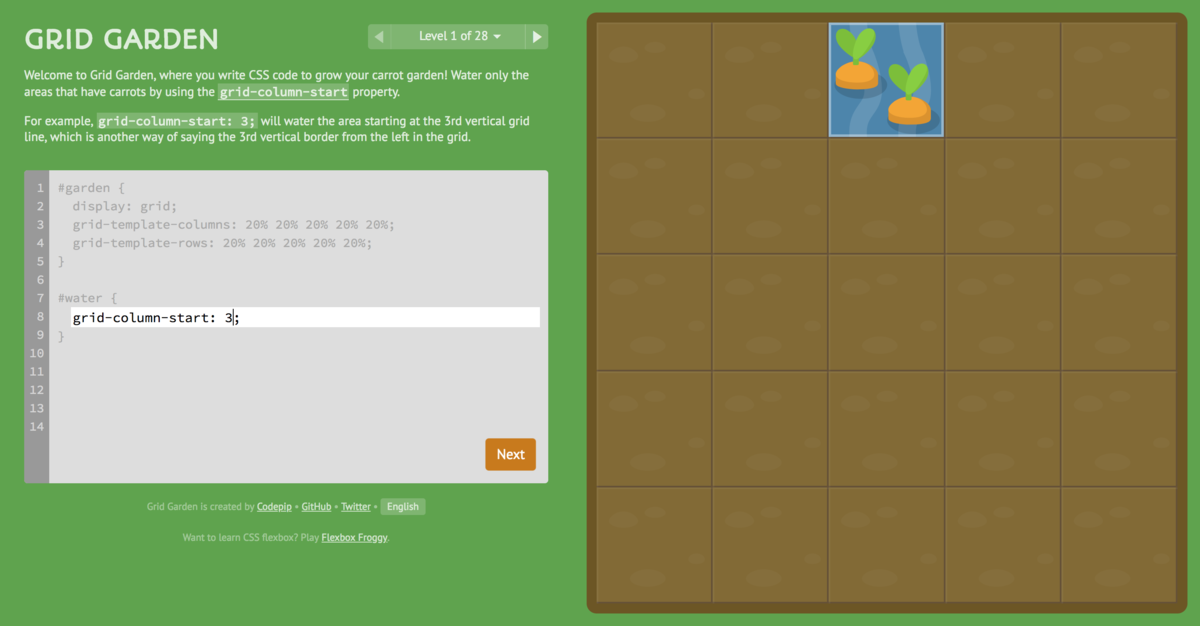
If you’re looking for a simple way to get stared with learning CSS Grid Layout, check this out.
Plus, the game is open source so if you hit a snag, file an issue. Great work Thomas Park!
The best way to learn, is to learn by doing!
While learning CSS Grid Layout, I’ve found that the best way to internalize all the new concepts and terminology is by working on various layouts using them. Recently, I decided to try to recreate the GitHub Contribution graph using CSS Grid Layout, and found it was an interesting challenge.
View the working code on CodePen.
Layout Land is a new YouTube channel from Mozilla and Jen Simmons focused on helping you learn about the new layout possibilities in web design.
If you’re looking to use CSS Grid but you need to support IE users, then you should check out this video and the rest of the series when you’re done. New videos every Tuesday and Thursday.
People always ask, “How can I dare to use this new CSS, when I need to support IE users?” It is very important to make sure every user can do what they came to your website to do, whether or not their browser supports the hot, new CSS you want to use. CSS Grid shipped in March 2017, and is already supported by the vast majority of web browsers in use. But there is a significant portion of users who do not have support for CSS Grid — not just IE, but also UC, Samsung Internet, Opera mini, QQ, and more. So can we use CSS Grid? How do we support these old browsers and use CSS Grid?
Responsive, sortable, filterable and draggable grid layouts
Lots to like here. Also the longest README I’ve seen in awhile.
Jack Moffitt joined the show to talk about Servo, an experimental web browser layout engine. We talked about what the Servo project aims to achieve, six areas of performance, and what makes Rust a good fit for this effort.
Overshare looks like a great solution to the common need of iOS apps to share their content with 3rd parties. It boasts:
And much more.
Using log messages in Rails can be a huge timesaver when you are debugging. With Rconsole you can save even more time by having those messages appear in the browser console. Rconsole is a fairly new gem with a lot of potential.
Installation is super simple. First add it to your Gemfile
:
group :development do
gem 'rconsole', '~> 0.1.0'
end
Then run bundle install
. Add to your layout view:
javascript_include_tag(:rconsole) if Rails.env.development?
To use Rconsole simply add rconsole.log
messages where you would normally insert logger.debug
, etc.
def show
rconsole.log 'Hello, Changeloggers!'
...
end
Now your browser will display your messages:
In addition to debugging, Rconsole is particularly useful when working with students or new rubyists to show the connection between what's happening in the controller and the view.
The entire code base is open source and available on GitHub.
We originally covered Foundation back at 2.0. That was before Foundation 3.0 where they re-wrote the styles in Sass (SCSS) and Compass rather than pure CSS.
Now, ZURB is at it again with Foundation 4.0 and this is what’s new.
Mobile first.
We've retooled Foundation from the ground up to be Mobile First. This is no hack job; we didn't just flip some media queries and call it a day. We went through the framework and rethought how grids should work, how components should work in a mobile-first paradigm, so we could be sure the solution we deliver in Foundation 4 is smart and sturdy.
Semantic.
We've built Sass mixins and extensions for almost every component of Foundation. Now you can write whatever markup is most semantic, most representative of what your content really is. Then, simply attach Foundation components to it in your Sass.
New (and Speedier) Javascript.
With Foundation 4, we wanted to make sure that not only were our Orbit, Reveal, Joyride, Clearing and Magellan plugins the best they could possibly be, but also that we were setting Foundation up for even greater plugins in the future. So, we rewrote them all.We’re also using Zepto.js, a jQuery API compatible library. This dramatically reduces how much your users will need to load (especially on mobile devices) and provides the added benefit of using CSS for animations, taking advantage of hardware acceleration where possible.
We've created some common layouts for you to start from so you can cook your site faster.
Check out the source on GitHub and the docs to get started.
A pleasant hat tip to Jolie O’Dell, a technology journalist for Venture Beat, for her post covering Reedit.
From the readme:
A minimalist, elastic and read-only Reddit web app client, that lets you create custom 'Channels' with up to 3 subreddits each.
On the project's GitHub page, Stand listed off the tech he used to build Reeddit, including Zepto.js ("jQuery for modern browsers"), Tappable ("great 'tap' events handler"), Mustache.js ("client-side templating"), reziseend.js ("better 'resize' handler"), and a couple others, as well.
Reedit is a simple read-only client for Reddit from Bernardo with three different responsive layouts for desktop, mobile, and tablet devices. Reedit also makes use of some other awesome open source projects such as Zepto.js, Tappable, Mustache.js and reziseend.js to name a few.
Check out the source or the read-only client to get your Reedit on.
The Rails 3 Asset Pipeline is super powerful, but it has one thing about it that’s truly annoying: tons of logger output in development mode. Here’s a simple Rails app’s log output when hitting an index page:
Started GET "/" for 127.0.0.1 at 2012-04-16 13:48:27 -0400
Processing by ArticlesController#index as HTML
Article Load (0.2ms) SELECT "articles".* FROM "articles"
Rendered articles/index.html.erb within layouts/application (2.3ms)
Completed 200 OK in 11ms (Views: 9.5ms | ActiveRecord: 0.2ms)
Started GET "/assets/authors.css?body=1" for 127.0.0.1 at 2012-04-16 13:48:27 -0400
Served asset /authors.css - 304 Not Modified (0ms)
[2012-04-16 13:48:27] WARN Could not determine content-length of response body. Set content-length of the response or set Response#chunked = true
Started GET "/assets/tags.css?body=1" for 127.0.0.1 at 2012-04-16 13:48:27 -0400
Served asset /tags.css - 304 Not Modified (0ms)
[2012-04-16 13:48:27] WARN Could not determine content-length of response body. Set content-length of the response or set Response#chunked = true
Started GET "/assets/jquery.js?body=1" for 127.0.0.1 at 2012-04-16 13:48:27 -0400
Served asset /jquery.js - 304 Not Modified (0ms)
[2012-04-16 13:48:27] WARN Could not determine content-length of response body. Set content-length of the response or set Response#chunked = true
Started GET "/assets/comments.js?body=1" for 127.0.0.1 at 2012-04-16 13:48:27 -0400
Served asset /comments.js - 304 Not Modified (0ms)
[2012-04-16 13:48:27] WARN Could not determine content-length of response body. Set content-length of the response or set Response#chunked = true
Started GET "/assets/tags.js?body=1" for 127.0.0.1 at 2012-04-16 13:48:27 -0400
Served asset /tags.js - 304 Not Modified (0ms)
[2012-04-16 13:48:27] WARN Could not determine content-length of response body. Set content-length of the response or set Response#chunked = true
Started GET "/assets/application.js?body=1" for 127.0.0.1 at 2012-04-16 13:48:27 -0400
Served asset /application.js - 304 Not Modified (0ms)
[2012-04-16 13:48:27] WARN Could not determine content-length of response body. Set content-length of the response or set Response#chunked = true
Seriously, I chopped about half of that out. Really, really annoying.
Enter quiet_assets. This little gem makes all of this junk go away. To install it, just add
gem 'quiet_assets', :group => :development
to your Gemfile, bundle, and breathe. Now, it just looks like this:
Started GET "/" for 127.0.0.1 at 2012-04-16 13:51:54 -0400
Processing by ArticlesController#index as HTML
Article Load (0.1ms) SELECT "articles".* FROM "articles"
Rendered articles/index.html.erb within layouts/application (2.7ms)
Completed 200 OK in 115ms (Views: 65.2ms | ActiveRecord: 1.8ms)
[2012-04-16 13:51:54] WARN Could not determine content-length of response body. Set content-length of the response or set Response#chunked = true
[2012-04-16 13:51:54] WARN Could not determine content-length of response body. Set content-length of the response or set Response#chunked = true
Much nicer. I can actually tell what’s going on!
The talented team at Zurb has released Foundation, a design scaffold for building web applications. Much like HTML5 Boilerplate, Foundation comes with some sensible markup defaults, however it goes farther with attractive styles for most interface elements in the spirit of Twitter’s Bootstrap project.
Along with a grid layout and form styling, Foundation also bundles two powerful Zurb JavaScript plugins: Orbit and Reveal.
While the front end code is server framework agnostic, Rails developers can integrate Zurb Foundation easily with the zurb-foundation gem which delivers foundation assets via the Rails 3.1 Asset Pipeline.
I’m sure that you’ve heard about Jekyll, but have you heard of Octopress? Well, Octopress 2.0 just surfaced and it’s definitely something that will get the hacking blogger happy.
Octopress is a framework designed by Brandon Mathis for Jekyll, the blog aware static site generator powering Github Pages. If you’ve ever picked up Jekyll to start a hacker blog, you were probably saddened when you realized that you’d have to write your own HTML templates, CSS, JavaScript and set up all your configuration. We’re the type of people who like frameworks and having the mundane taken care of for us.
That’s exactly the problem that Octopress solves, and then some.
Octopress is really easy to set up and deploy and Brandon has done a great job documenting how to get started.
For help, head to convore.com/octopress or #octopress on irc.freenode.net. Also be sure to follow @octopress and @imathis on Twitter.
Brandon also made an appearance on Episode 0.1.7 where we talked about Open Source publishing with Geoffrey Grosenbach, Brandon Mathis, and Tim Caswell.
Check out the source on GitHub and the Octopress homepage for more details.
Ron DeVera reached out to us a few weeks back to let us know about a new project he’s working on at Mint Digital called AssetHat.
AssetHat is a Rails gem that hopes to make the web a little bit quicker by making front-end assets (CSS, JS and images) load faster (especially on mobile devices). It does the usual minification and concatenation, but unlike others, AssetHat automatically takes advantage of Google’s CDN and cdnJS for loading common third-party libraries. There’s even a little switch to enable LABjs mode, so you can quickly A/B test to see whether LABjs is right for their site.
Google said it best, “Every millisecond counts. Nothing is more valuable than people’s time.” So do what you can to save your users some time and make your project faster.
AssetHat is super-easy to set up for Rails 3 (or even Rails 2.3 with Bundler):
app/views/layouts/application.html.erb:
<%= stylesheet_link_tag 'reset', 'application', :cache => 'application' %>
<%= javascript_include_tag Rails.env.production? ?
'http://ajax.googleapis.com/ajax/libs/jquery/1.6.0/jquery.min.js' :
'jquery-1.6.0' %>
<%= javascript_include_tag 'plugin1', 'plugin2', :cache => 'plugins' %>
<%= javascript_include_tag 'application' %>
app/views/layouts/admin.html.erb:
<%= stylesheet_link_tag 'reset', 'admin', :cache => 'admin' %>
<%= javascript_include_tag Rails.env.production? ?
'http://ajax.googleapis.com/ajax/libs/jquery/1.6.0/jquery.min.js' :
'jquery-1.6.0' %>
<%= javascript_include_tag 'plugin1', 'plugin2', :cache => 'plugins' %>
<%= javascript_include_tag 'admin' %>
app/views/layouts/application.html.erb:
<%= include_css :bundle => 'application' %>
<%= include_js :jquery, :bundles => ['plugins', 'application'] %>
app/views/layouts/admin.html.erb:
<%= include_css :bundle => 'admin' %>
<%= include_js :jquery, :bundles => ['plugins', 'admin'] %>
Use a config file to keep your layouts lightweight config/assets.yml
:
css:
bundles:
application: ['reset', 'application']
admin: ['reset', 'admin']
js:
vendors:
jquery:
version: 1.6.0
bundles:
plugins: ['plugin1', 'plugin2']
application: ['application']
admin: ['admin']
Installation and configuration is easy, read the details at their site, or check out the readme for full details.
As the mobile space continues to grow, there has been a growing interest in Responsive Web
Design,
making use of CSS media
queries to selectively target
device screen size and layout orientation in CSS stylesheets. But as
Jason
Grigsby points out, media queries have
substantial
drawbacks. Since media queries only filter styles and (and related image assets) on the client, you may end up pushing a lot of data down to the client that the user may never see. In mobile applications, this is extremely costly.
Nathan Smith, JavaScript hacker and
creator of the 960 Grid System has released
Adapt.js, a lightweight JavaScript library that
will let you specify a list of stylesheets and the screen sizes for
which they should be loaded:
// Edit to suit your needs.
var ADAPT_CONFIG = {
// Where is your CSS?
path: 'assets/css/',
// false = Only run one time, when page first loads.
// true = Change for window resize or page tilt too.
dynamic: true,
// First range entry is the minimum.
// Last range entry is the maximum.
// Should have at least one "to" range.
range: [
'760px = mobile.css',
'760px to 960px = 720.css',
'960px to 1280px = 960.css',
'1280px to 1600px = 1200.css',
'1600px to 1920px = 1560.css',
'1920px = fluid.css'
]
};
When your page loades, the appropriate layout is written to the <head>
of your document based on the screen width of the page. If you enable the
dynamic
setting, additional stylesheets will be fetched when the user
resizes the browser window or rotates their mobile device.
Nathan admits that every project is different and there are tradeoffs
between stylesheet size and extra network hops:
As with any area in which technological approaches are open for debate, there is the danger of religious fanaticism, where we each rally behind a respective method and defend it vehemently. I would caution you to weigh the options, consider mobile users, and choose an approach makes sense for you.
Sinatra 1.2 is out and thanks to R. Konstantin Haase and others, The Chairman has added a number of ditties to his set list. Highlights of the release include:
For Ruby 1.9 users, you can now use named captures in your routes:
get %r{/(?<year>d{4})/(?<month>d{2})/(?<day>d{2})/?} do
date = Date.new params[:year].to_i, params[:month].to_i, params[:day].to_i
@posts = Post.pubished_on date
erb :posts
end
As Sinatra fans, we’re excited about this release anxious to see what projects like Padrino and NestaCMS can do with it.
We’re big fans of open source publishing tools. Although Tumblr has been a good way to bootstrap this blog, we have a dream to move on to something with a bit more publishing oomph. Thanks to Graham Ashton, NestaCMS is looking to be the future platform for The Changelog. Nesta is now a Ruby gem and has a shiny new web site.
For those not familiar with Nesta, it’s a bit like Nanoc or Jekyll, but instead of generating 100% pure static pages, it relies on HTTP cache to get the best of both worlds, dynamic content and static delivery. Geoffrey Grosenbach uses a custom Nesta setup to power the Peepcode blog.
If you’re not a designer, the default Nesta theme includes the basic design elements of a good blog or web site:
Now that Nesta has been gemified, your project only needs to worry about content and templates, all the Nesta plumbing is provided by the gem. To start, install the gem:
gem install nesta
Now we have a nesta
command line interface:
» nesta
USAGE: nesta [GLOBAL OPTIONS] <command> [COMMAND OPTIONS]
GLOBAL OPTIONS
--help, -h Display this message.
COMMANDS
new <path> Create a new Nesta project.
demo:content Install example pages in ./content-demo.
theme:install <url> Install a theme from a git repository.
theme:enable <name> Make the theme active, updating config.yml.
theme:create <name> Makes a template for a new theme in ./themes.
OPTIONS FOR new
--git Create a new git repository for the project.
--vlad Include config/deploy.rb.
To create a new site, just type:
nesta new my_cool_blawg
This unfurls a basic Sinatra-powered Rack app with a folder for your content:
my_cool_blawg » ls -la ~/Projects/sandbox/my_cool_blawg
total 16
drwxr-xr-x 6 wynn staff 204 Feb 18 08:41 .
drwxr-xr-x 11 wynn staff 374 Feb 18 08:41 ..
-rw-r--r-- 1 wynn staff 116 Feb 18 08:41 Gemfile
drwxr-xr-x 3 wynn staff 102 Feb 18 08:41 config
-rw-r--r-- 1 wynn staff 175 Feb 18 08:41 config.ru
drwxr-xr-x 4 wynn staff 136 Feb 18 08:41 content
You can add some dummy content as well:
nesta demo:content
Now you can crank up nesta with Shotgun (or Passenger, etc.):
shotgun config.ru
… and browse to your site on [http://localhost:9393]
What we love about Nesta is the front matter, or metadata you can drop into each file for arbitrary bits of info. Here’s how we’re using it in our upcoming blog rewrite:
Date: 2010-05-20 12:33:27 GMT
tumblr_id: 616093411
categories: github,typography,css
github_repo: typekit/webfontloader
title: WebFont Loader - easy @font-face from Google, TypeKit, or your own site
# WebFont Loader - easy @font-face from Google, TypeKit, or your own site
Thanks to greater browser support for [@font-face](http://www.font-face.com/#lime_content), web typography is breaking free from the same boring font stacks we've known for the last ten years. As with any new technique, @font-face introduces new challenges for finding the right cross-browser syntax, especially to avoid things like Firefox's [Flash of Unstyled Text](http://paulirish.com/2009/fighting-the-font-face-fout/) issue.
...
This allows you to fully customize how you serve up your content, even specifying per-post templates or layouts.
Nesta also has great theme support. You can create your own theme:
theme:create <name> #Makes a template for a new theme in ./themes.
… or install from a url:
theme:install <url> Install a theme from a git repository.
Since Nesta plays nice with Heroku’s readonly filesystem, its a great cheap (or free) way to host a blog or any content-heavy site.
Another great fit for Nesta is as a mountable site inside another Rack application. You can easily have Nesta power your blog inside your Rails application:
MyApp::Application.routes.draw do
mount MyHawtBlawg.new => "/blog"
# other rails routes
...
end
Nesta has a growing community. Be sure and join the mailing list, follow on @NestaCMS on Twitter, or join us in #nesta
on IRC.
When writing up this project, a CMS from GBH at TWG, I felt a bit like Robin Williams’ character in Good Morning Vietnam when he said.
Excuse me, sir. Seeing as how the VP is such a VIP, shouldn’t we keep the PC on the QT? ‘Cause if it leaks to the VC he could end up MIA, and then we’d all be put out in KP.
Comfortable Mexican Sofa, from Oleg Khabarov AKA @GroceryBagHead at The Working Group, is a nifty engines-based Content Management System you can drop into any Rails 3 app. What struck me the most is the clean {{ }}
-style tag syntax you’re probably used to in Mustache, Tumblr, or ExpressionEngine:
{{ cms:page:content:text }}
‾ tag format or extra attributes
‾‾‾‾‾‾‾ label/slug/path for the tag,
‾‾‾‾‾‾‾‾‾‾‾‾ tag type (page, field, snippet, helper, partial)
‾‾‾‾‾‾‾‾‾‾‾‾‾‾‾‾ cms tag identifier
To use CMS, configure the gem in your Gemfile
:
config.gem 'comfortable_mexican_sofa'
… and run bundle install
.
Next, run the supplied generator to create the required database migrations and initializer, and migrate up.
rails g cms
rake db:migrate
Now you can start creating layouts, pages, snippets, and other content in the supplied admin interface:
CMS can share your existing application layouts and CMS content can even be served up inside of regular Rails views:
def show
@help = HelpTopic.find(params[:id])
# CMS page probably should have either helper or partial tag to display @help details
render :cms_page => '/help'
end
Even the admin panel is extensible, just have your admin controllers inherit from CMS’s BaseController
:
class Admin::CategoriesController < CmsAdmin::BaseController
# your code goes here
end
If you simply need to extend the admin UI, try using the view hooks:
ComfortableMexicanSofa::ViewHooks.add(:navigation, '/admin/navigation')
Be sure and check the extensive Readme for advanced usage, especially for the tag syntax.
I don’t always use WordPress, but when I do, I prefer Thematic (and compass-wordpress). Thematic is a WordPress theme framework from Ian Stewart that provides an abstracted API, letting you focus on your site instead of the lower-level minutia of WordPress.
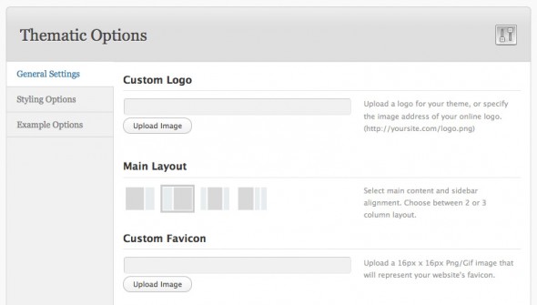
I was excited when I stumbled across a couple of projects by Devin Price that let you easily expose an options panel for your theme. Thematic Options (and the non-Thematic Options Framework) make it easy to add an options panel for your theme settings, letting your end users customize your theme in the WordPress admin panel.
Options are declared in a PHP array, as in this example:
// Set the Options Array
global $my_options;
$my_options = array();
$my_options[] = array( "name" => "General Settings",
"type" => "heading");
$my_options[] = array( "name" => "Custom Logo",
"desc" => "Upload a logo for your theme, or specify the image address of your online logo. (http://yoursite.com/logo.png)",
"id" => "logo",
"std" => "",
"type" => "upload");
$url = ADMIN . 'images/';
$my_options[] = array( "name" => "Main Layout",
"desc" => "Select main content and sidebar alignment. Choose between 1, 2 or 3 column layout.",
"id" => "layout",
"std" => "2c-l-fixed.css",
"type" => "images",
"options" => array(
'1col-fixed.css' => $url . '1col.png',
'2c-r-fixed.css' => $url . '2cr.png',
'2c-l-fixed.css' => $url . '2cl.png',
'3c-fixed.css' => $url . '3cm.png',
'3c-r-fixed.css' => $url . '3cr.png')
);
$my_options[] = array( "name" => "Custom Favicon",
"desc" => "Upload a 16px x 16px Png/Gif image that will represent your website's favicon.",
"id" => "custom_favicon",
"std" => "",
"type" => "upload");
$my_options[] = array( "name" => "Tracking Code",
"desc" => "Paste your Google Analytics (or other) tracking code here. This will be added into the footer template of your theme.",
"id" => "google_analytics",
"std" => "",
"type" => "textarea");
...
Devin has a nice blog post with more info including how to use these values in your theme, along with an introductory screencast.
Ezra Zygmuntowicz, Engine Yard founder now at VMWare, has released a “killer build of nginx” that bundles seventeen popular nginx modules as well as Luajit, a just-in-time compiler for Lua.
Super-nginx bundles the following popular modules:
ngx_devel_kit
- an Nginx module that adds additional generic tools that module developers can use in their own modulesset-misc-nginx-module
- Various set_xxx directives added to nginx’s rewrite module (md5/sha1, sql/json quoting, and many more)ngx_http_auth_request_module
- Add HTTP auth to nginxecho-nginx-module
- An Nginx module for bringing the power of “echo”, “sleep”, “time” and more to Nginx’s config filememc-nginx-module
- An extended version of the standard memcached module that supports set, add, delete, and many more memcached commands.lua-nginx-module
Embed Lua into nginxsrcache-nginx-module
- Transparent subrequest-based caching layout for arbitrary nginx locations.drizzle-nginx-module
- wire up nginx to Drizzlerds-json-nginx-module
- An nginx output filter that formats Resty DBD Streams generated by ngx_drizzle and others to JSON nginx-eval-module
- A module for evaluating memcached or proxy response into variablexss-nginx-module
- Native support for cross-site scripting (XSS) in an nginxngx_http_upstream_keepalive
encrypted-session-nginx-module
- Encrypt and decrpt nginx variablesform-input-nginx-module
- reads HTTP POST and PUT request body encoded
in “application/x-www-form-urlencoded”, and parse the arguments in
request body into nginx variables.headers-more-nginx-module
- Set, add, and clear arbitrary output headers in nginxredis2-nginx-module
- Nginx upstream module for the Redis 2.0 protocol A nice complement to the built-in Redis and Drizzle support from the list above, Ezra has also included his own script to build Luajit, which allows you to use nginx as an evented Lua web server in the style of EventMachine or Node.js.
Interface Builder is one of the coolest things about Cocoa development. Being able to draw your interfaces visually can save you tons of otherwise tedious code to create layouts and set visual styles for your user interface elements.
Adrian Kosmaczewski, iPhone and iPad developer and creator of Device DNA and several other apps in the App Store turned us on to nib2objc, which is a brilliant name because it takes NIB (or XIB) files from Interface Builder and converts them to Objective-C.
To run from the command line, simply run nib2objc
, passing the path to your NIB file:
nib2objc yourfile.xib > code.m
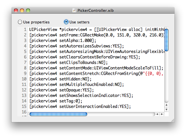
The output is a rather nice looking set of UIKit objects and property assignments to match values from your NIB:
// ...
UIView *view6 = [[UIView alloc] initWithFrame:CGRectMake(0.0, 0.0, 320.0, 460.0)];
view6.frame = CGRectMake(0.0, 0.0, 320.0, 460.0);
view6.alpha = 1.000;
view6.autoresizingMask = UIViewAutoresizingFlexibleWidth | UIViewAutoresizingFlexibleHeight;
view6.backgroundColor = [UIColor colorWithWhite:0.750 alpha:1.000];
view6.clearsContextBeforeDrawing = NO;
// ...
UIButton *button9 = [UIButton buttonWithType:UIButtonTypeRoundedRect];
button9.frame = CGRectMake(167.0, 65.0, 72.0, 37.0);
button9.adjustsImageWhenDisabled = YES;
button9.adjustsImageWhenHighlighted = YES;
button9.alpha = 1.000;
button9.autoresizingMask = UIViewAutoresizingFlexibleRightMargin | UIViewAutoresizingFlexibleBottomMargin;
button9.clearsContextBeforeDrawing = NO;
button9.clipsToBounds = NO;
button9.contentHorizontalAlignment = UIControlContentHorizontalAlignmentCenter;
// ...
[button9 setTitleShadowColor:[UIColor colorWithWhite:0.000 alpha:1.000] forState:UIControlStateSelected];
// ...
[view6 addSubview:button9];
// ...
As an added bonus, nib2objc includes a GUI to browse NIB files and even peer into their generated Objective-C code, complete with Fragaria-based syntax highlighting.
Check the project home page for more details, not to mention the most minimalistic Redmine theme we’ve seen.
But wait, there’s more. We also stumbled across Adrian’s other project Bluwoki, a Bluetooth peer-to-peer walkie-talkie for iPhone and iPod Touch. Since my daughters get their Dad’s old hand-me-down iPhones, I may have to install this for them to have some fun around the house. Bluwoki is also open source, grab the code on GitHub.
We gave a nod to CoffeeKup, Maurice Machado’s CoffeeScript ode to Markaby last month. Maurice is back with a new CoffeeScript ditty.
Zappa is a highly opinionated DSL for writing Node.js apps on top of Express - using CoffeeScript. Be sure and check out Episode 0.2.9 on CoffeeScript and Episode 0.3.1 on Websockets and Socket.IO for a little background if you missed them.
To get started, assuming you’ve got Node and Express installed, install Zappa via npm:
npm install zappa
You then can fire up your Zappa app from the command line:
$ zappa cuppa.coffee
=> App "default" listening on port 5678...
Just like Sinatra, routes are mapped to handlers using the four HTTP verbs:
get '/:foo': ->
@foo += '!'
render 'index'
You can declare that index
view in the same file with the view
function:
view index: ->
h1 'You said:'
p @foo
Layouts? You bet:
layout ->
html ->
head -> title "You said: #{@foo}"
body -> @content
Currently views and layouts support Coffeekup only, but that might change.
You can’t really talk about Node without discussing its inherent asynchronous nature. Zappa makes async style programming straightforward as well:
def sleep: (secs, cb) ->
setTimeout cb, secs * 1000
get
'/': -> redirect '/bar'
'/:foo': ->
@foo += '?'
sleep 5, =>
@foo += '!'
@title = 'Async'
render 'default'
view ->
h1 @title
p @foo
Zappa also has support for Socket.IO out of the box, so Websockets programming is a snap.
get '/': -> render 'default'
get '/counter': -> "# of messages so far: #{app.counter}"
at connection: ->
app.counter ?= 0
puts "Connected: #{id}"
broadcast 'connected', id: id
at disconnection: ->
puts "Disconnected: #{id}"
msg said: ->
puts "#{id} said: #{@text}"
app.counter++
send 'said', id: id, text: @text
broadcast 'said', id: id, text: @text
client ->
$(document).ready ->
socket = new io.Socket()
socket.on 'connect', -> $('#log').append '<p>Connected</p>'
socket.on 'disconnect', -> $('#log').append '<p>Disconnected</p>'
socket.on 'message', (raw_msg) ->
msg = JSON.parse raw_msg
if msg.connected then $('#log').append "<p>#{msg.connected.id} Connected</p>"
else if msg.said then $('#log').append "<p>#{msg.said.id}: #{msg.said.text}</p>"
$('form').submit ->
socket.send JSON.stringify said: {text: $('#box').val()}
$('#box').val('').focus()
false
socket.connect()
$('#box').focus()
view ->
@title = 'Nano Chat'
@scripts = ['http://code.jquery.com/jquery-1.4.3.min', '/socket.io/socket.io', '/default']
h1 @title
div id: 'log'
form ->
input id: 'box'
button id: 'say', -> 'Say'
As a fan of CoffeeScript, I’ll be kicking the tires on this for my next Node app.
Want to create an eBook but don’t want to futz with learning new tools? Davide Casali, Marco Colombo, and Alessandro Morandi have created Baker, a new framework to let you create books for the iPad using HTML5, CSS3, and JavaScript. Baker aims to do for books what PhoneGap has done for HTML5 web apps in just three steps.
Baker currently supports portrait layouts, so just design your book using a web layout 768px wide. Pages can be as tall as you want and will scroll anything over 1024px. Multiple chapters are supported using separate HTML files.
Drop the contents of your book into a /book
folder, naming chapters sequentially as 1.html
, 2.html
, 3.html
, etc. You may use subfolders for assets, but your chapters must be in the root folder.
To publish your book, you’ll need an Apple Developer account. Then you can publish your book using the Baker XCode project, renaming the project to reflect your book title as well supplying your own icon for the App Store. Check out full instructions in the README